Crafting a rebrand for
EF / Go Ahead Tours
How might we craft brand connection with internal and external audiences?
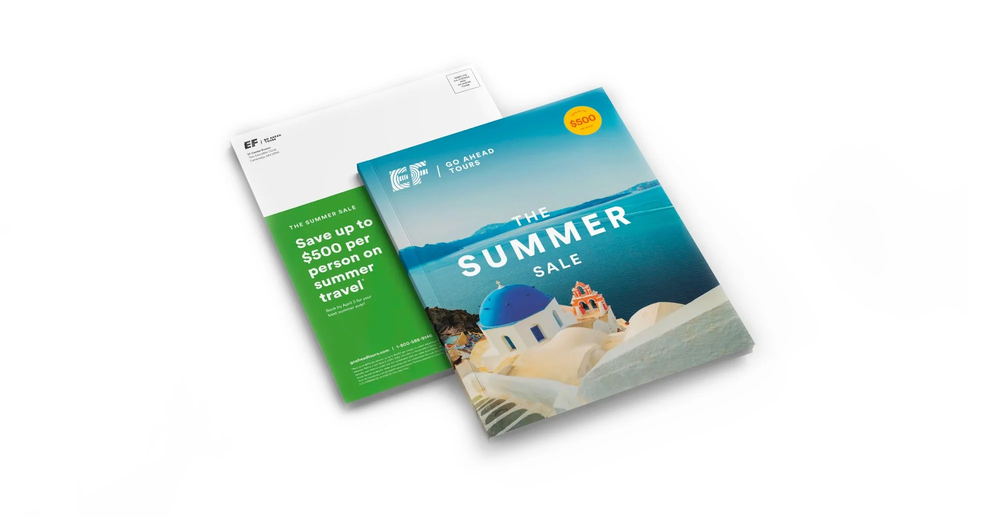
The tour experience has long been the most beloved aspect of traveling with EF Go Ahead Tours—but the brand surrounding it failed to capture that same sense of warmth and discovery. In an increasingly crowded guided travel market, the company undertook a full-scale rebrand to create a more distinctive and emotionally resonant identity.
As Senior Designer, I helped shape the creative direction and translate it into a scalable brand system used across marketing, product, and customer experiences, reaching millions of travelers each month.
The resulting concept—Contemporary Nostalgia—reimagines the romance of vintage travel through a modern lens: soft, warm, and dreamlike, yet structured and contemporary in its execution.
To bring this vision to life, I led development of several foundational elements of the identity system, including the typography framework, color palette, editorial layout system, illustration style, and paid and organic social campaign templates. I also helped design and structure the brand book, translating creative direction into practical guidance that allowed teams across the company to apply the identity consistently.
The system was designed to scale across hundreds of campaigns, destinations, and marketing channels while remaining flexible enough for internal teams to adapt and evolve over time.
ROLE
Design
Art Direction
Branding
Brand Design System
TEAM
GAT Creative Team
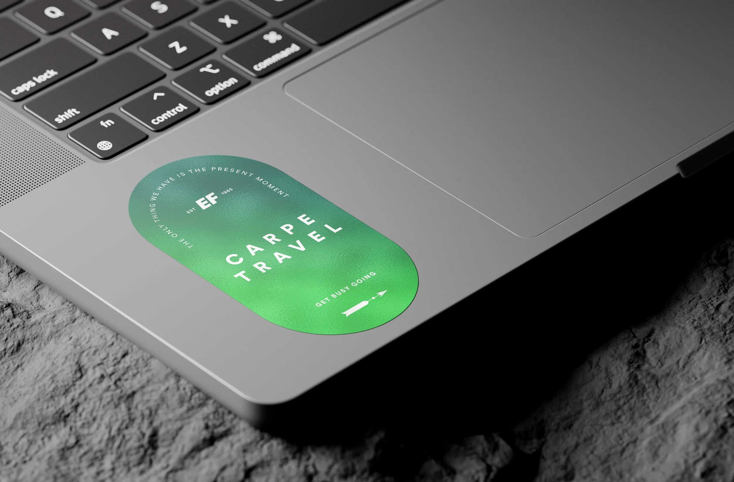
Logo
Paul Rand, one of the most respected and revered graphic designers of the 20th century, conceptualized the central EF logo, with its distinctive, rippling “waves”. As a product of EF, we use our own lockup of the logo across all of our internal and external materials.
Maintain a safe zone around the logo equivalent to half the logo height (x).
Minimum logo height: 0.35” / 32px
Secondary logos & lockups
Digital lockup for smaller device sizes
For internal projects and post-booking materials
Application
White over Primary green
Black over white and neutral backgrounds
White over dark images
Black over light images
Color
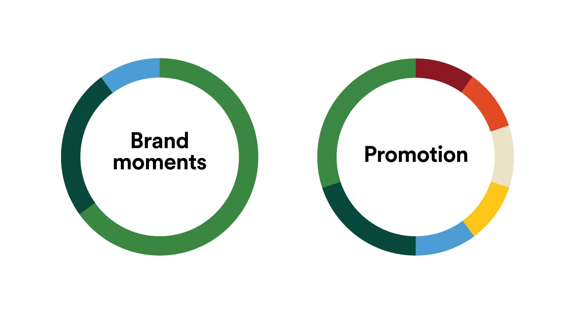
We determined two targeted color systems: high-level brand interactions and promotional accents.
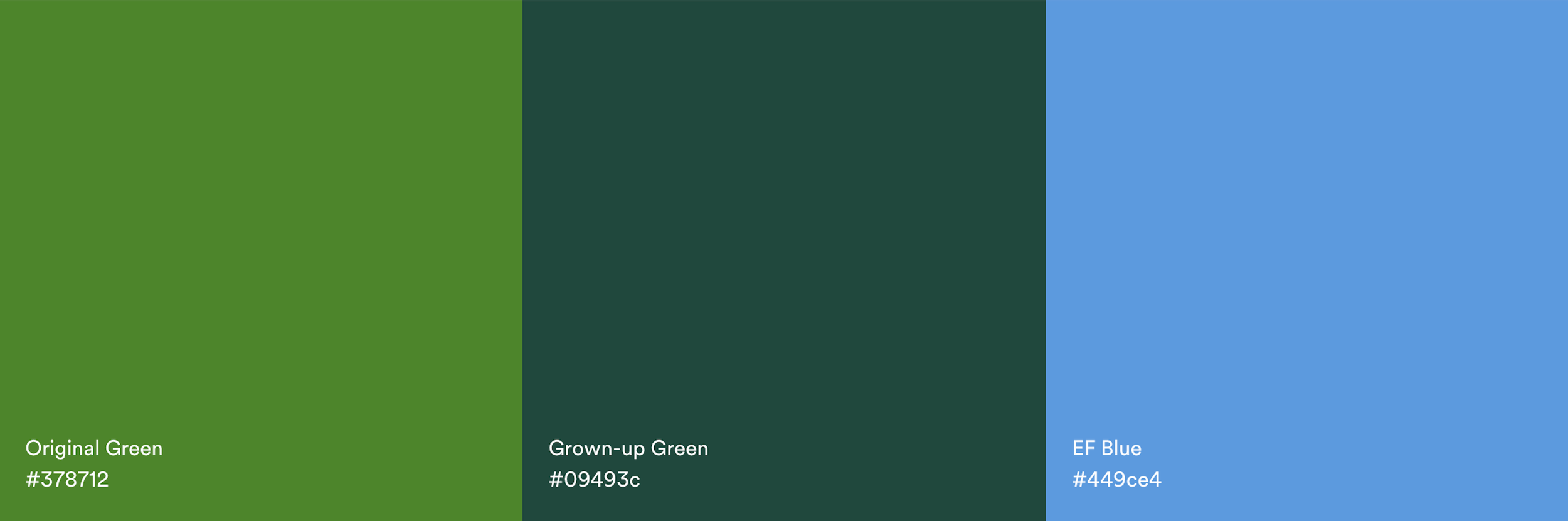
Core
Original Green
Like Go Ahead, there’s nothing else quite like Original. It stands out in a crowd, and we dip into this color when we need to do just that. Use Original on the back of direct-mail pieces, on calls to action (CTAs), to make a line of copy pop—wherever a little extra excitement is needed.
Grown-Up Green
We use Grown-Up Green to show the more sophisticated and mature side of who we are. It’s strong, present, and trustworthy. Use Grown-Up Green when you need to communicate confidence and steadiness.
EF Blue
EF Blue connects us to our Education First roots. It highlights our shared commitment to opening the world through education. EF Blue should never be used as the primary color in a layout, but rather as an accent or highlight after a first instance of Original or Grown-Up Green.
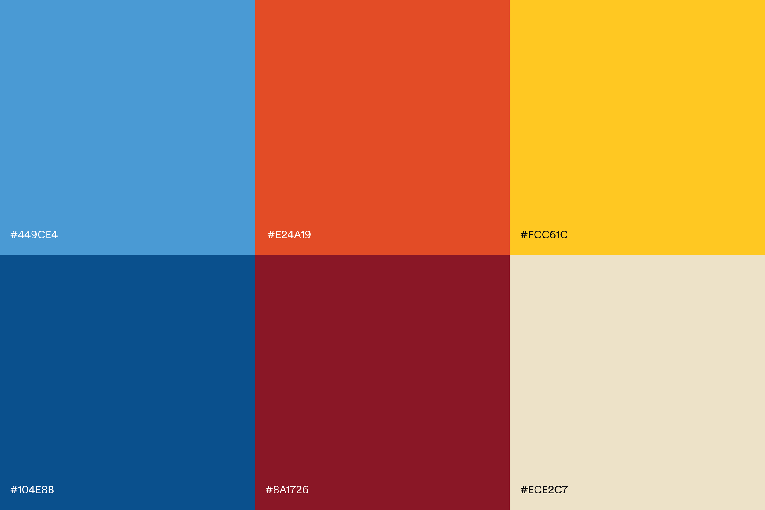
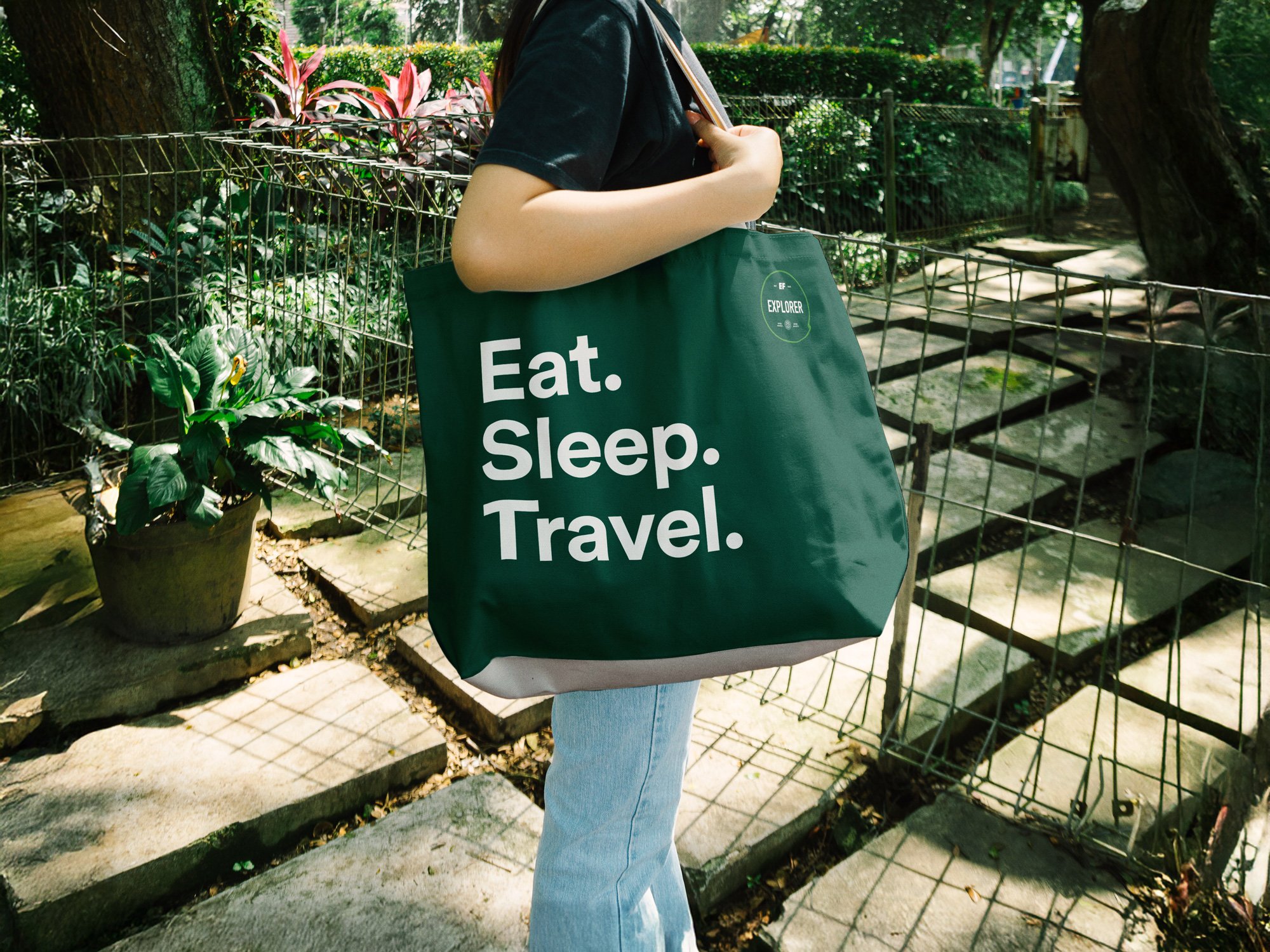
Historically, across our sales campaigns, color use varied extensively. With monthly sales campaigns, designers had taken creative liberties, using colors lifted from sale hero imagery, using those for email CTAs, dot whacks, and campaign backgrounds. Over time, this created a diluted and chaotic system that did not stand for a distinguishable brand. I crafted a system that complemented the core colors, but could stand on its own to drive attention and urgency to limited-time deals.
Promotional
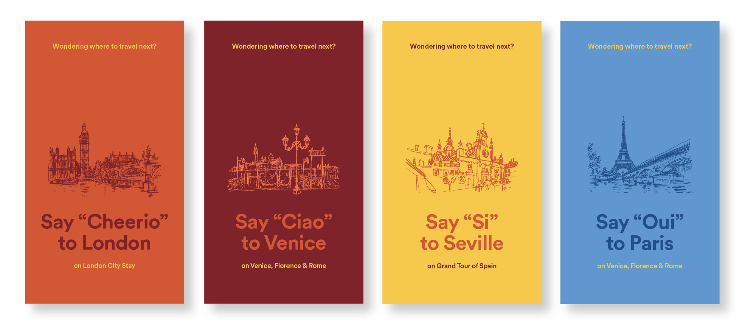
Social examples
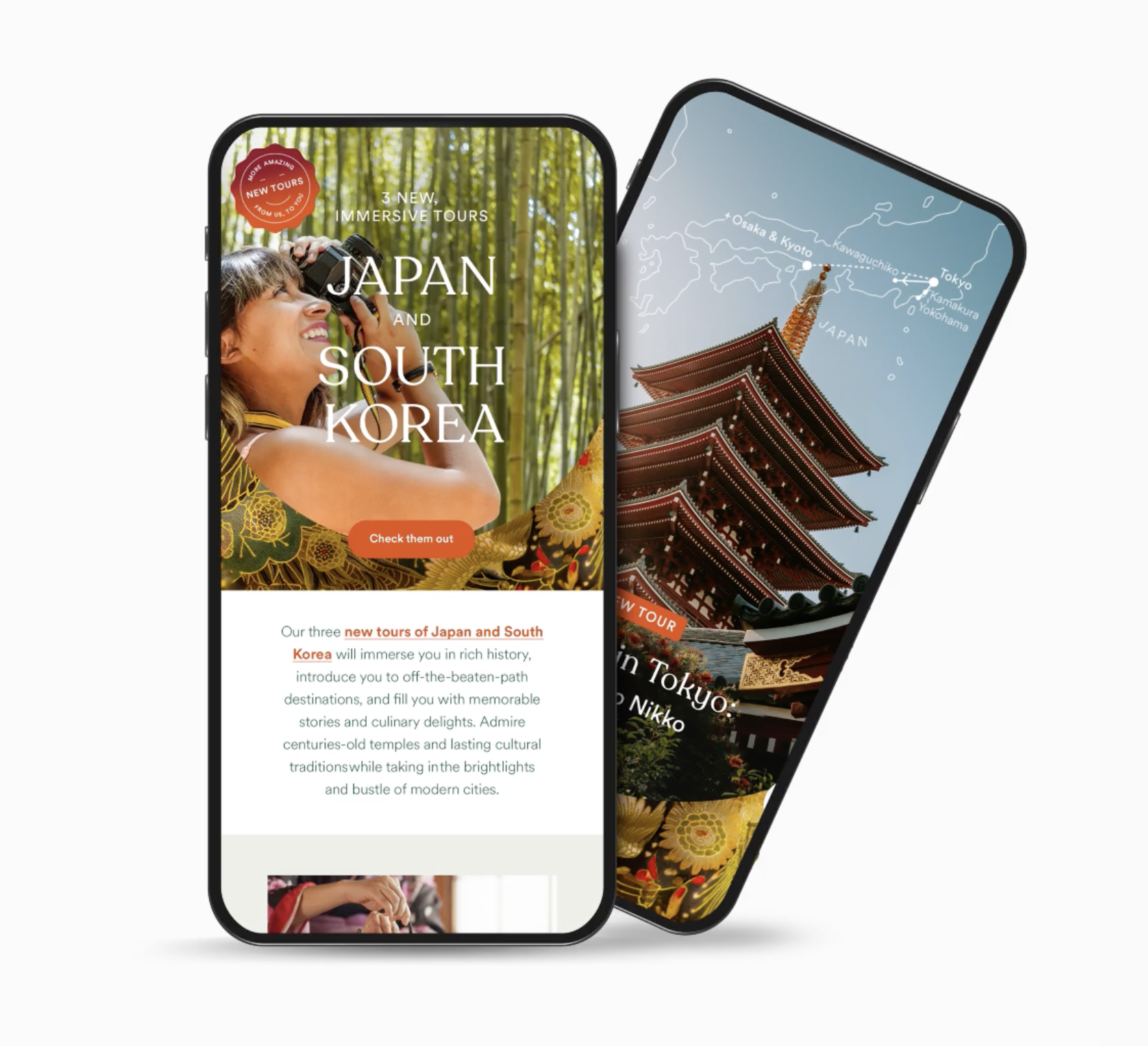
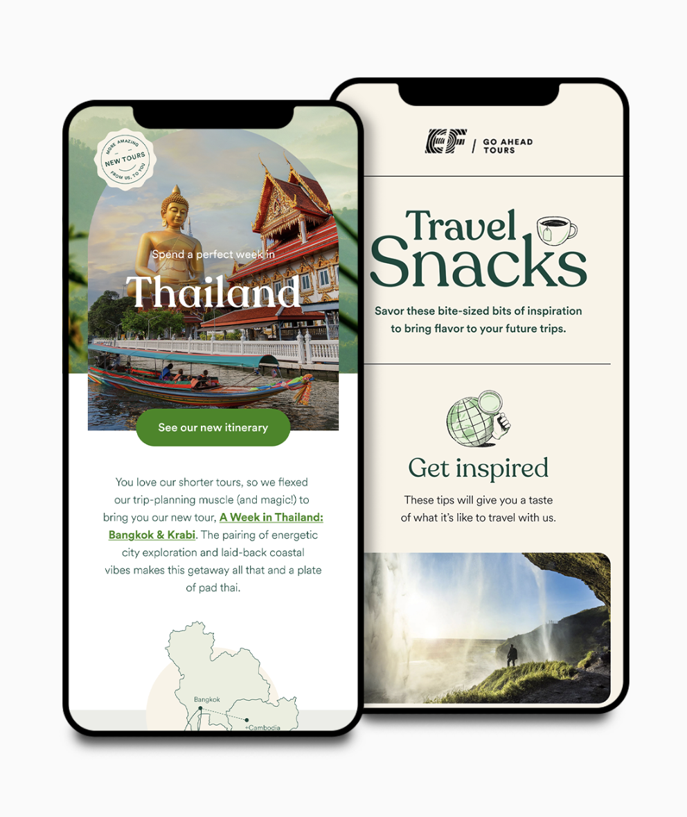
Photography
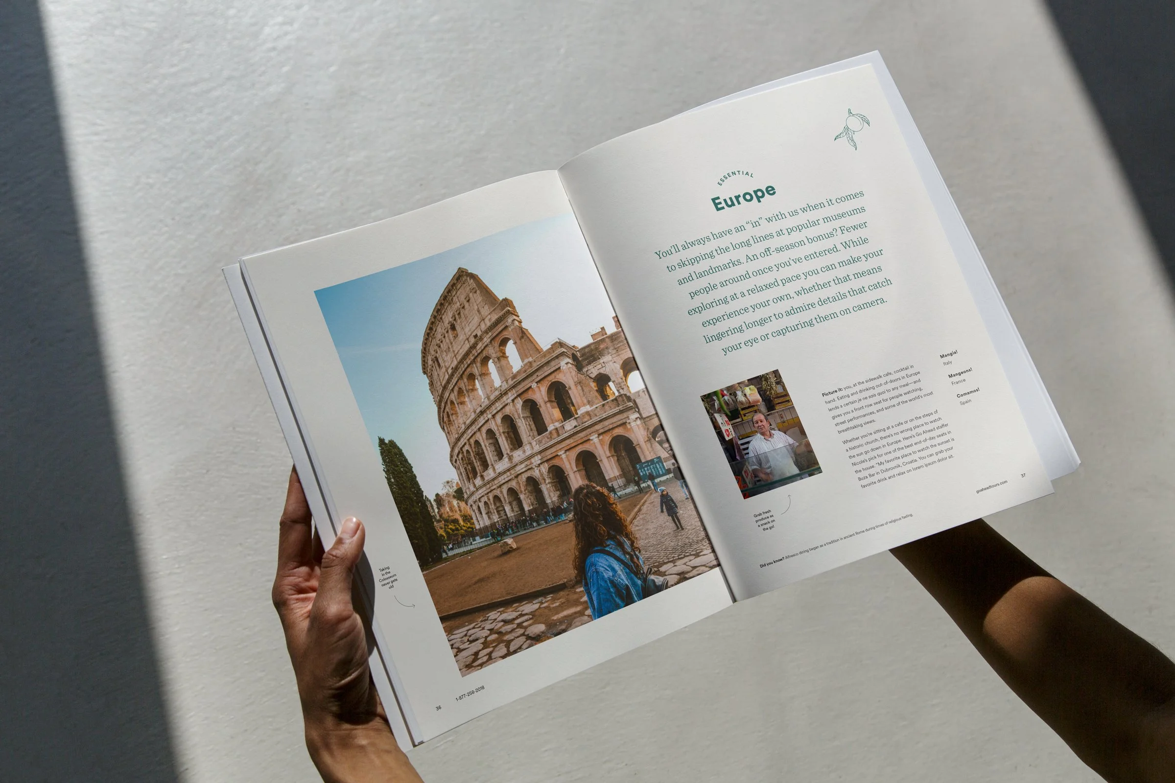
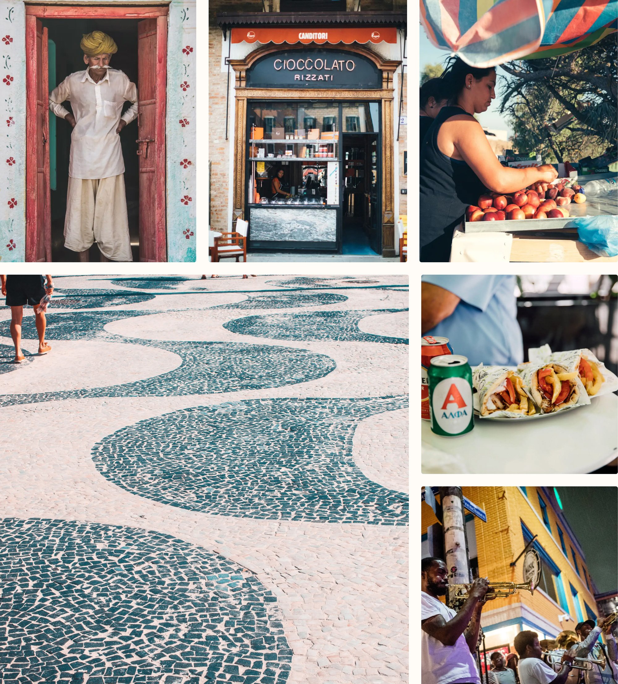
For our many brand and marketing placements, we may draw upon hero destination images or traveler images to communicate a different story or angle in each. We often used an organic layout style which had an informal formula: destination image, traveler image, textural moment. The buckets below illustrate the guidelines for each.
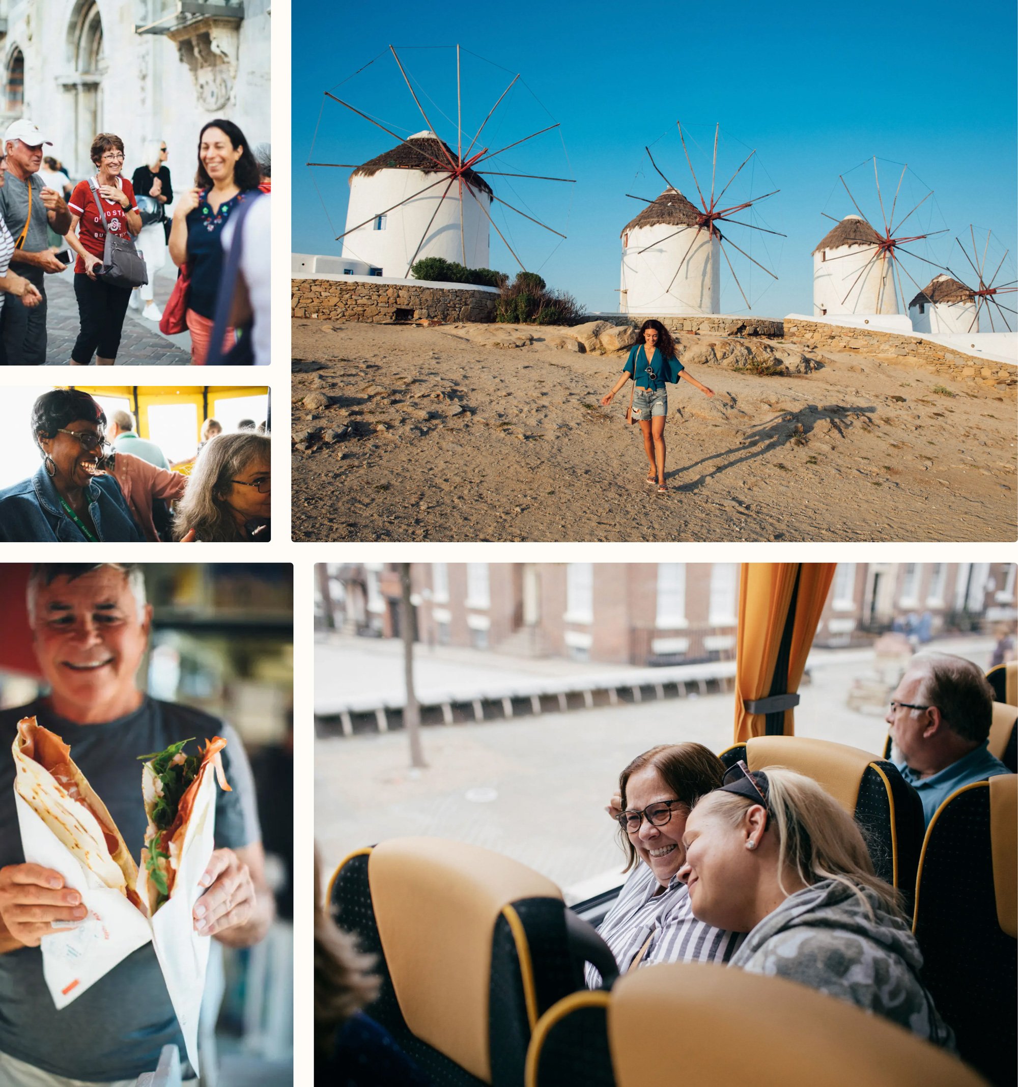
Look for unfiltered joy, awe, and wonder from single subjects and group interactions. Educational moments with Tour Directors, local guides, and vendors are great, too. Embrace the in-between moments, and avoid staged or posed photos.
Traveler moments
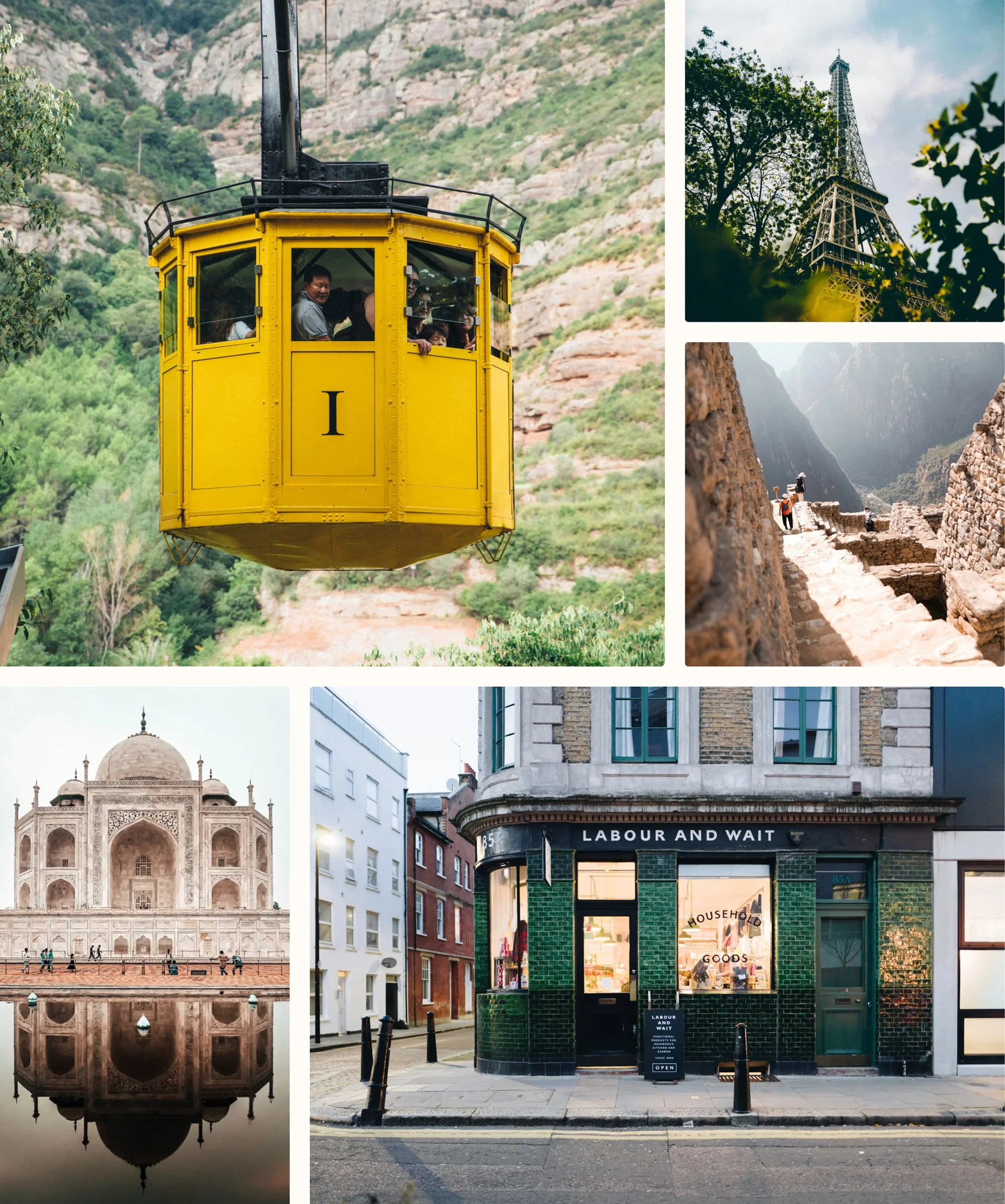
Choose street-level, photojournalistic angles of iconic sites and culturally relevant events. For example, our travelers may lie down on the grass on the Champs de Mars to marvel at the Eiffel Tower, so capture it that way.
Sightseeing moments
Environmental vignettes
We love everyday moments and interactions with locals. They give the viewer a true sense of cultural immersion.
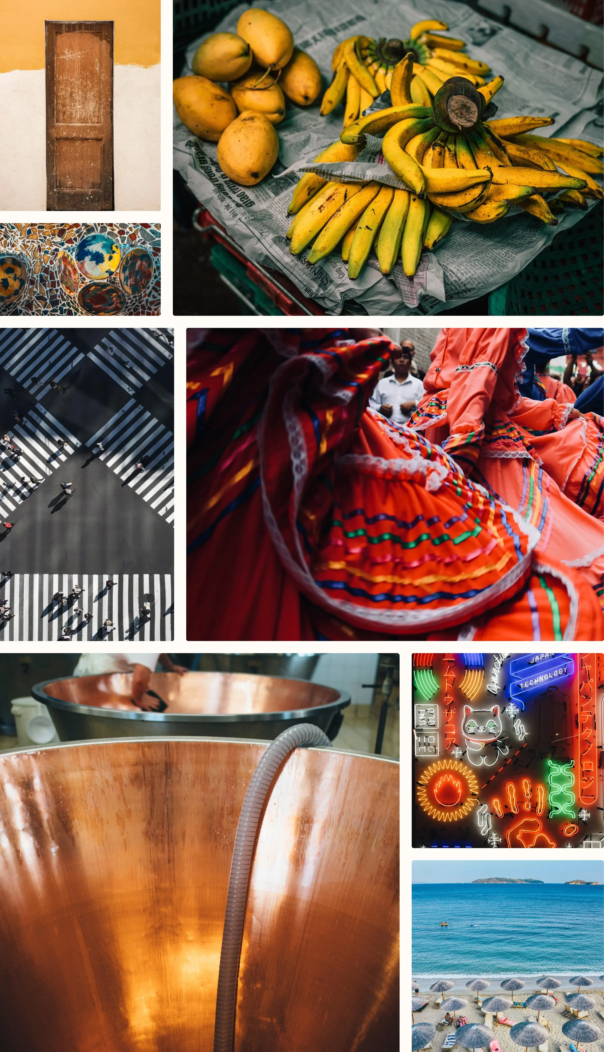
We’re all about authenticity and deep exploration, and details help us show that. So, frame up a cultural nod, a textural element, or a moment others may have missed.
Details that matter
Illustration
For our illustration system, I led several workshops with our design team to explore and hone in on style, texture, expression, weight, and tone. We landed on an elegant yet imperfect line style to be used as textural moments in a piece—never as hero.
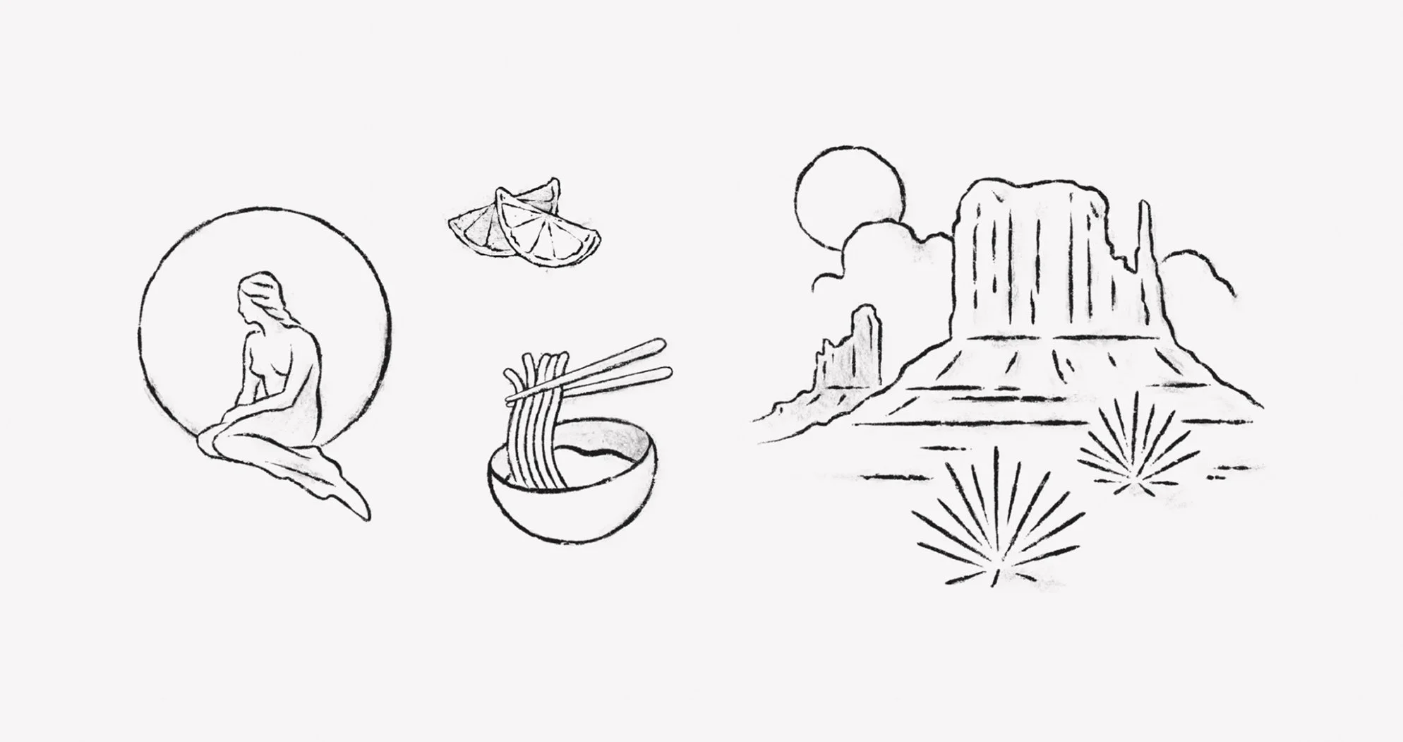
These illustrations are meant to look like breezy sketches a traveler might make while sipping a cappuccino at a café overlooking a bustling boulevard. Every line feels effortless and natural—just like our travel experience. Illustrations are always used as accents, never as hero.
A touch of hand
Typography
To maintain consistency and connection to our core EF design system, we utilized our own custom cuts of Circular—EF Circular—as our primary typeface. To communicate warmth, ,softness, and a touch of editorial sophistication, we drew upon a secondary typeface—Recoleta—for traveler quotes, intros to destinations in print pieces, and more.
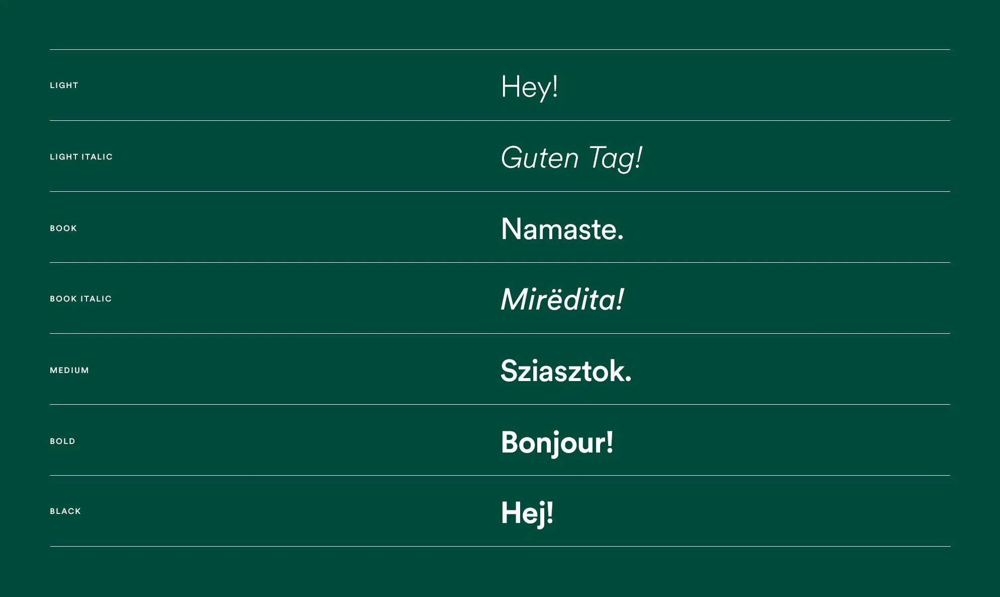
EF Circular has five weights, with two cuts of each (Roman and Italic). Resist the urge to use the weights in multiple configurations on a single layout. As our grandmothers always told us: It’s better to be pragmatic and reductive with our typeface weight choices.
Be conservative with italics. We use them only for titles of books, plays, films, and periodicals, the names of vessels, or to put a little emphasis on a single word.
EF Circular
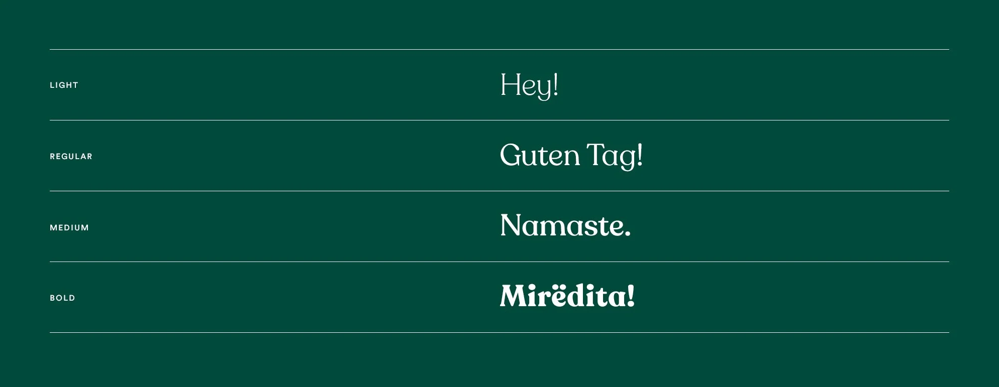
Recoleta is our secondary typeface. Think of it like the caramelized sugar on your Parisian crème brûlée. It’s meant to add warmth, texture and a human touch to the brand.
Recoleta is most often used in the traveler voice—quotes, callouts, and second-level headings. That said, it’s been known to pop up in a headline here or there—just be thoughtful about where and how you use it.
Recoleta
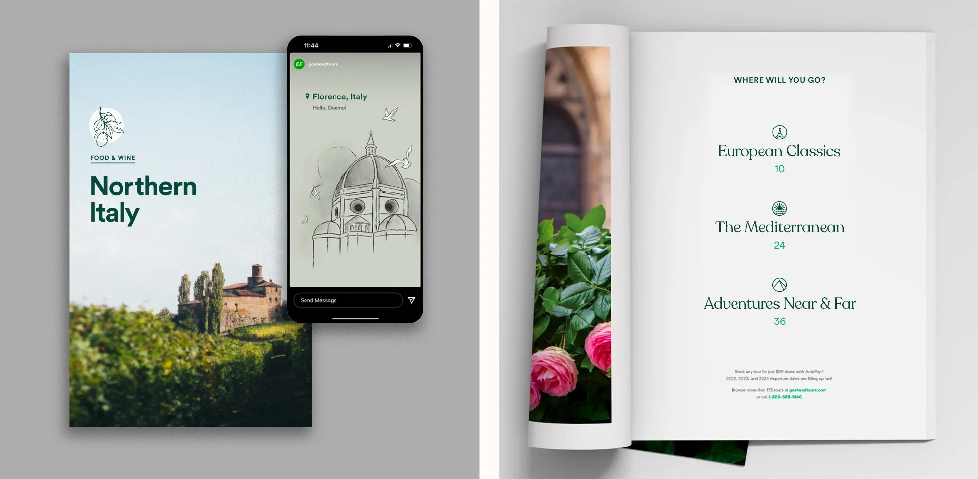
Brand in context