

Archive
SNIPPETS OF DESIGN WORK FROM 2013–2020

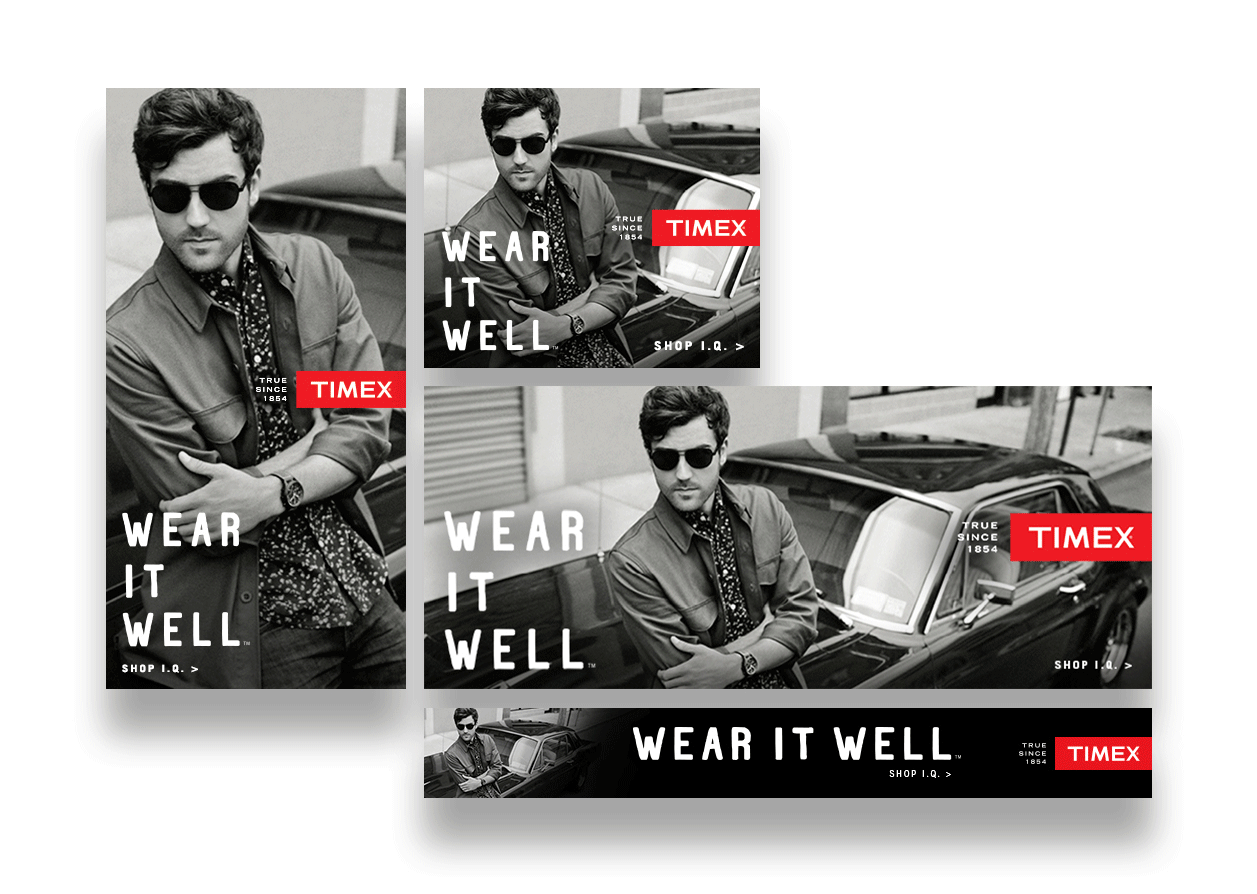
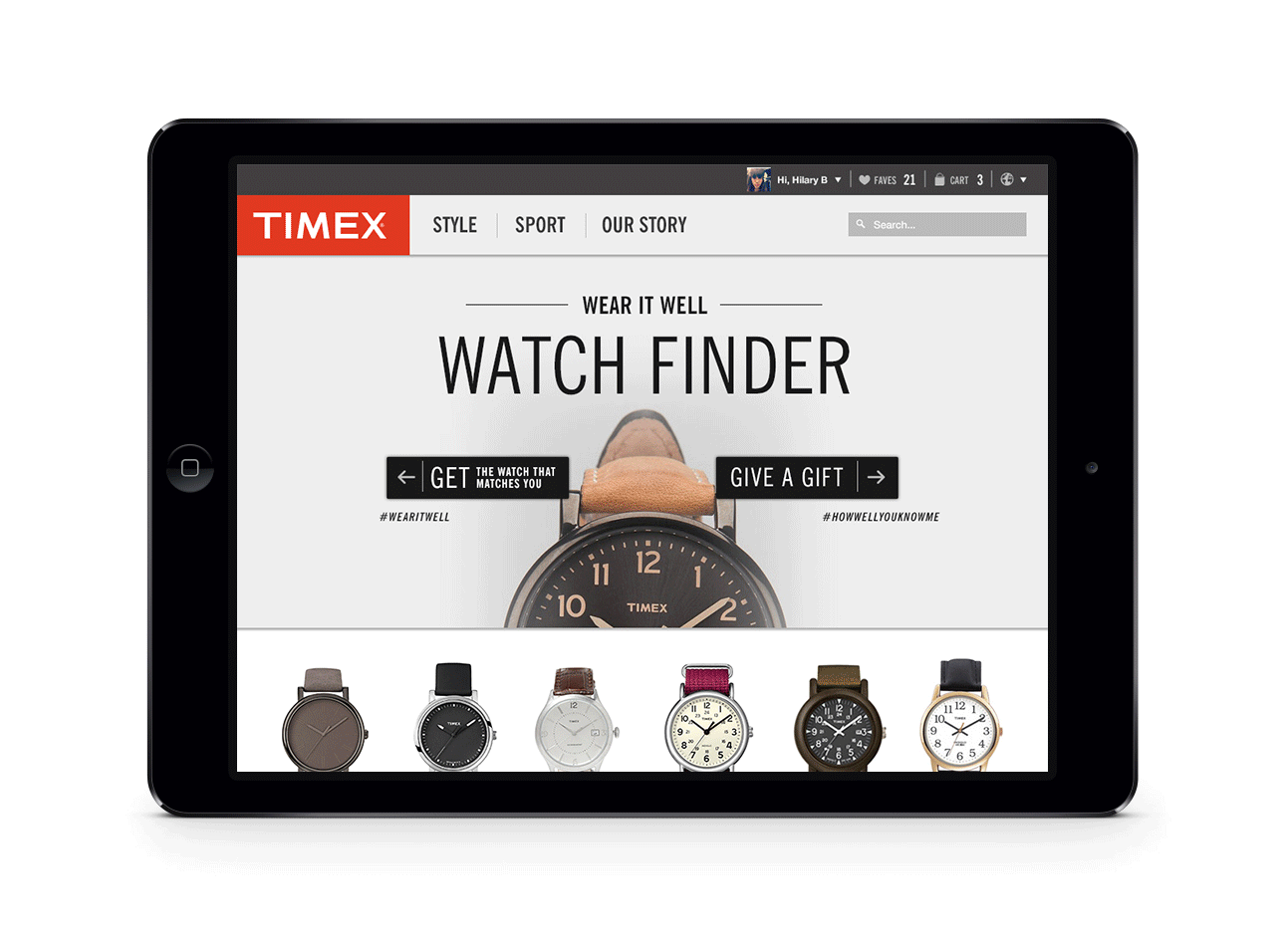
TIMEX
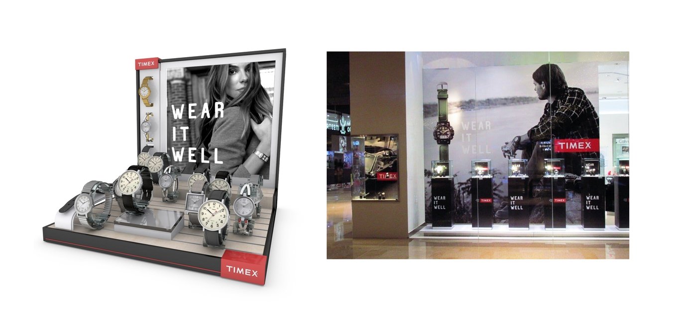
Wear It Well Campaign
At Toth + Co, I contributed to the repositioning and global campaign for Timex, Wear It Well.
The work spanned print, digital, OOH, social, film, and retail, along with brand standards and logo refinements.
The campaign was rooted in a simple insight: customers treat their watches as personal artifacts—placed alongside their most valued belongings at the end of each day. This informed a visual approach that layered product with lived context, pairing still-life precision with human narrative.
I photographed initial watch studies in-house to establish the direction, which was later scaled across global campaign assets.
The line Wear It Well emerged from generational language within the brand itself, paired with customer insights to define a tone grounded in authenticity and restraint.
I contributed to the development of the visual system, including photographic direction—favoring black-and-white imagery with a sense of intimacy, nostalgia, and everyday presence.
PHOTOGRAPHY BY WE ARE THE RHOADS


CAMBRIDGE SAVINGS BANK
Modernizing an institution
I was contracted by Full Contact Advertising to aid in the rebranding of the oldest institution in Cambridge after Harvard — Cambridge Savings Bank. The team at CSB wanted to refresh their dated branding and design to better represent their current digital efforts and presence while maintaining ties to their legacy and storied past.
Founded in 1835, CSB has endured World Wars, the Great Depression, and decades of tales both trying and triumphant. They have evolved into an institution that protects billions of dollars in assets, all the while maintaining a steadfast commitment to their relationships with their clients and community, and their reputation of being trustworthy and accommodating problem solvers.
Discovery
Cambridge Savings is a local bank that sits smack dab in the middle of an extremely competitive landscape, vying against banks both large and small, in addition to emerging fintech competitors.
CSB's brand presence was visibly dated, and did not adequately reflect its brand DNA, nor its technological advances and competitive service offerings. They sought Full Contact Advertising (who, in turn, sought me) to aid in the rebrand. The rebrand needed to allow CSB to stand distinctly among the crowd of local banks in the region, reflect its modern digital capacities, and bring the overall aesthetic into the 21st century and beyond.
Quantitative research indicated that among banks local to the Cambridge/Boston area, CSB was rated markedly higher than its competition in characteristics most touted by local banks: stable, approachable, courteous, reliable, trustworthy, smart, and relationship-oriented. We used these traits as guideposts for visual exploration.
KEY TRAITS
Stable
Approachable
Trustworthy
Courteous
Sincere
Reliable
Local
Historic
Innovative
Accommodating
Relational
COMPETITION
Cambridge Trust
East Cambridge Savings
Rockland Trust
Brookline Bank
Eastern Bank
Citizens Bank
Santander

During my research phase, I photographed the building, looking for interesting historical and architectural details that could be used to tie to the branding. I found this iron motif, which I used as inspiration for use of the acronym form of the logo, as well as connected lettering. The shape of the building itself was used as inspiration for a containing shape for the lettering – in earlier phases, it was more realistically depicted, and later resulted in a simplified representation of the building ratio.
I sketched an update to the iron detailing and brought the concept into Illustrator for more detailed work.


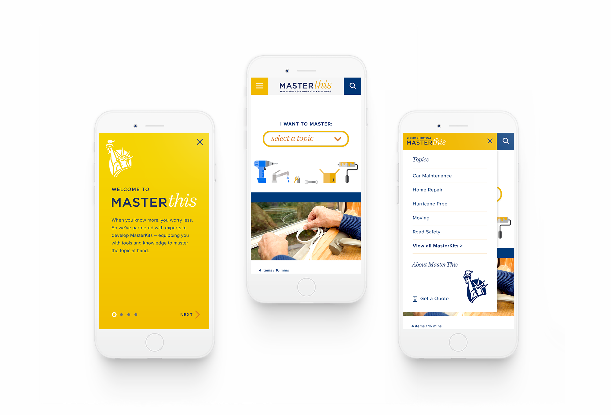
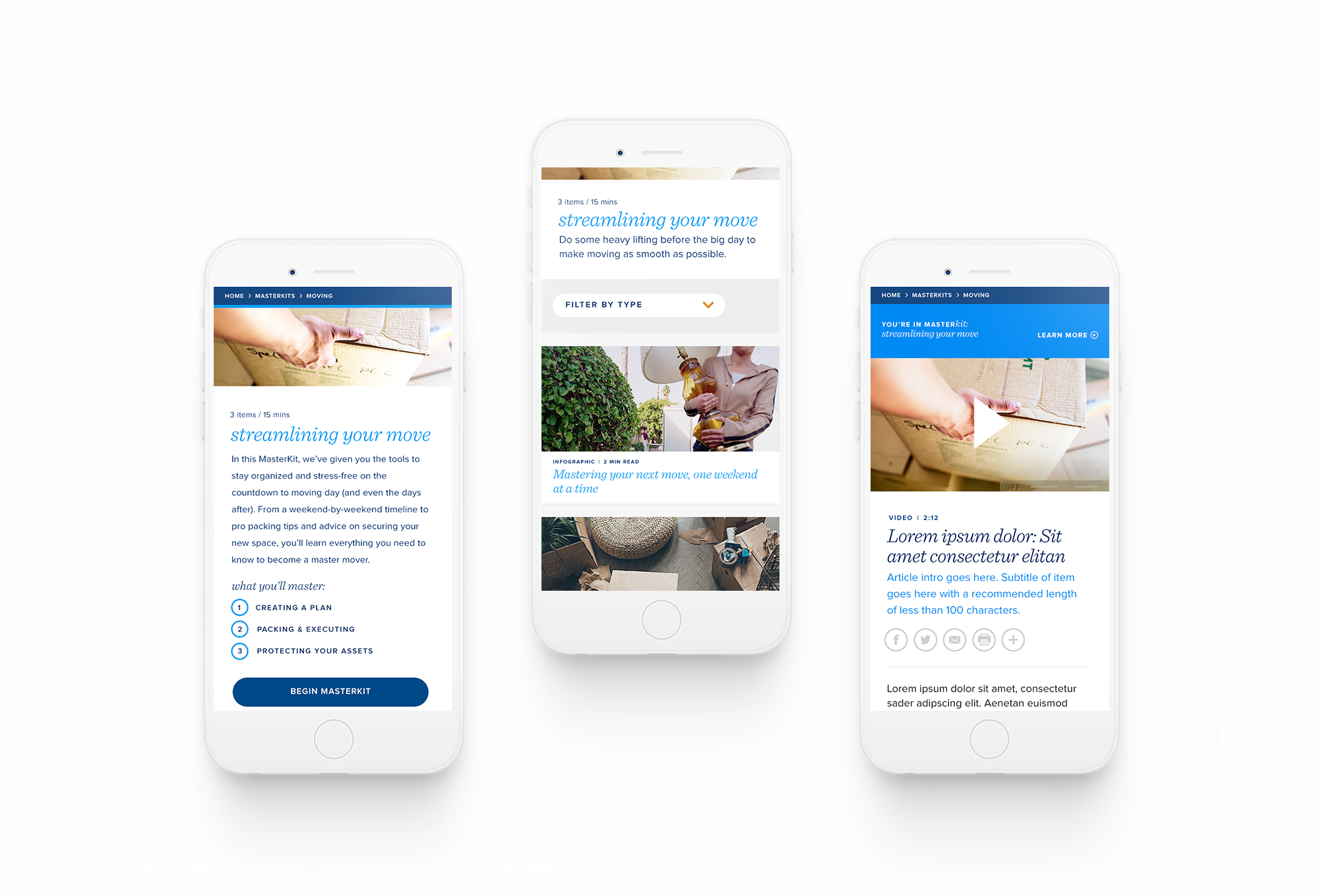
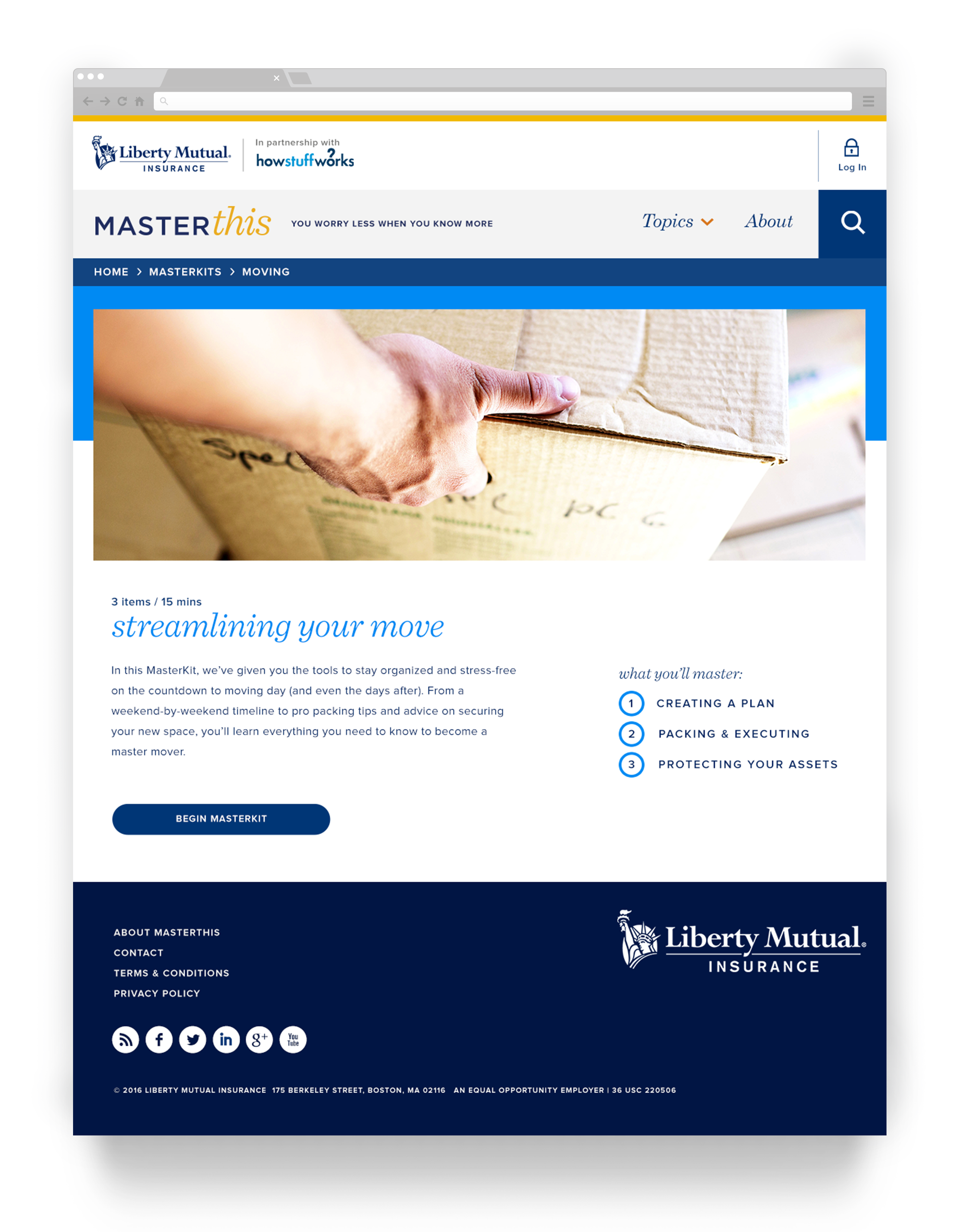
LIBERTY MUTUAL
A custom content hub to empower customers
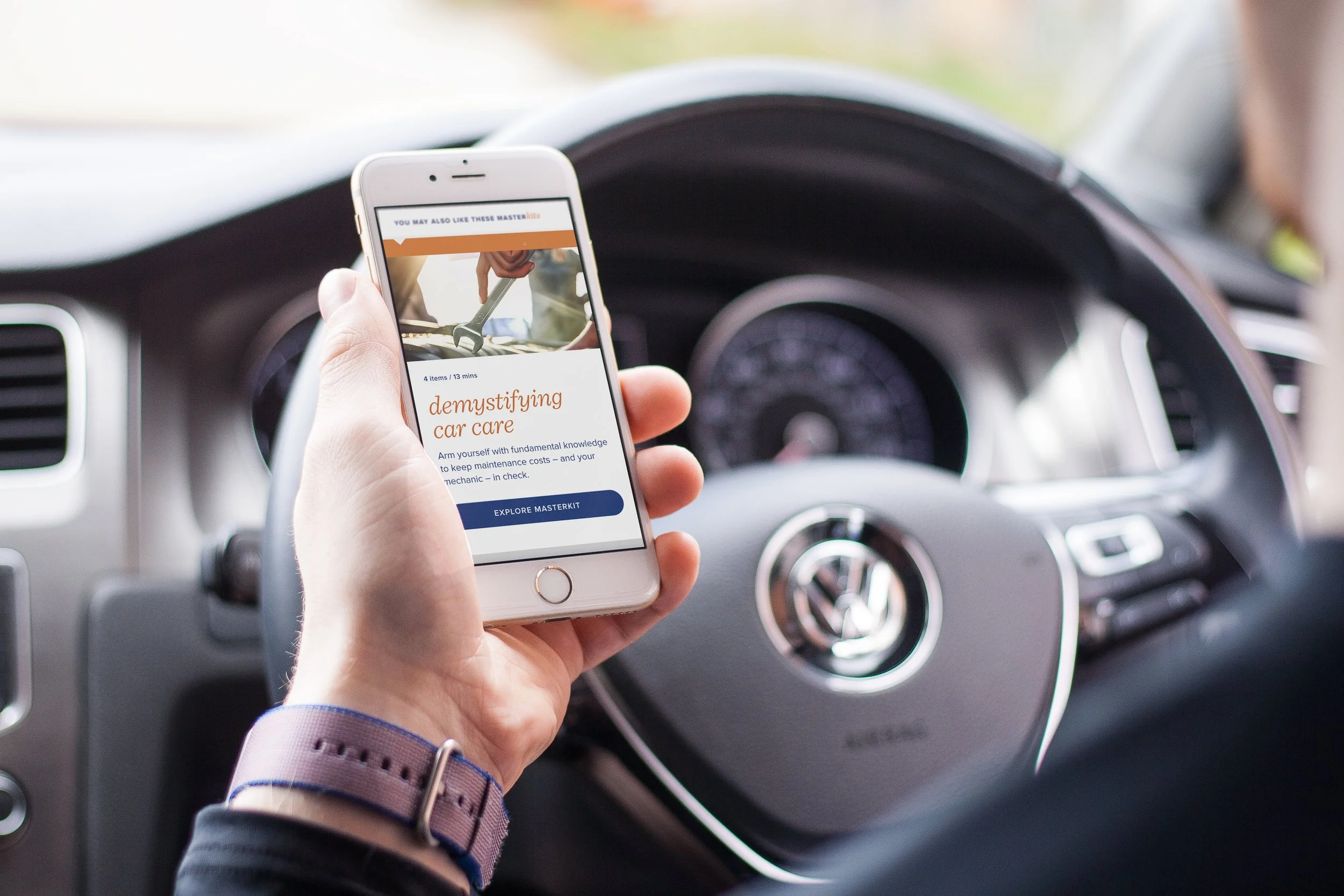
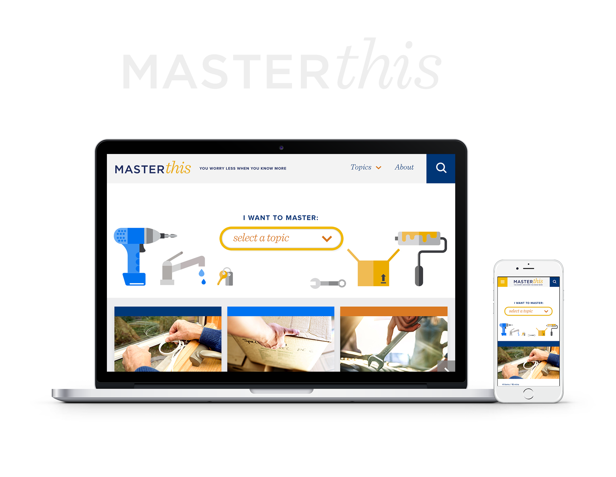
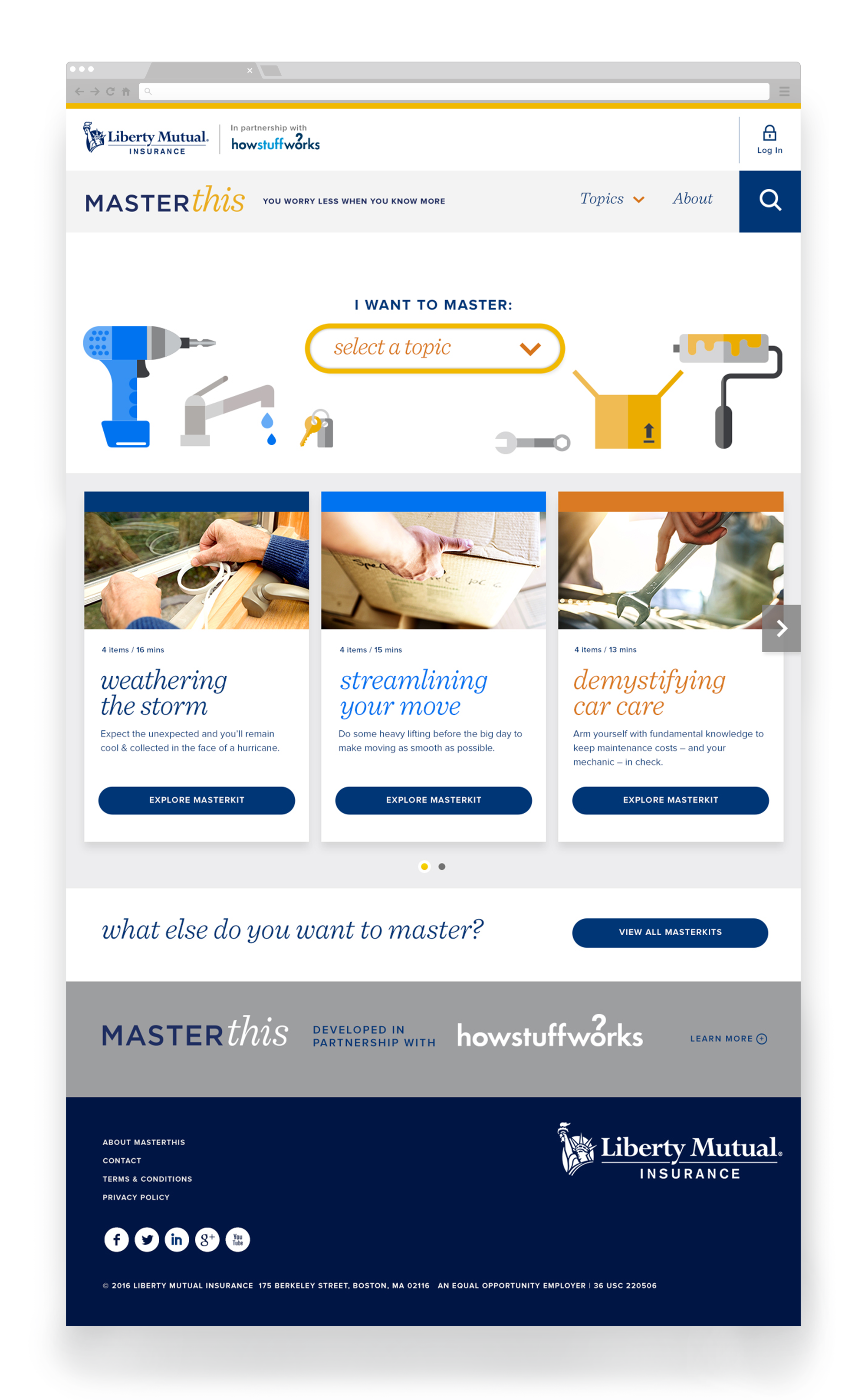
MASTERthis was a digital product created by Genuine and Jack Morton Worldwide for Liberty Mutual.
The platform served as a content hub designed to help users navigate common concerns across home, auto, and life. Its core structure—MASTERkits—organized information into focused, multi-format guides on topics like moving, car maintenance, and home winterization.
I led design and art direction across the experience, collaborating with 50+ partners across agencies. My work included identity development, color and photography direction, and responsive web design—ensuring a scalable component system and AA-level accessibility throughout.


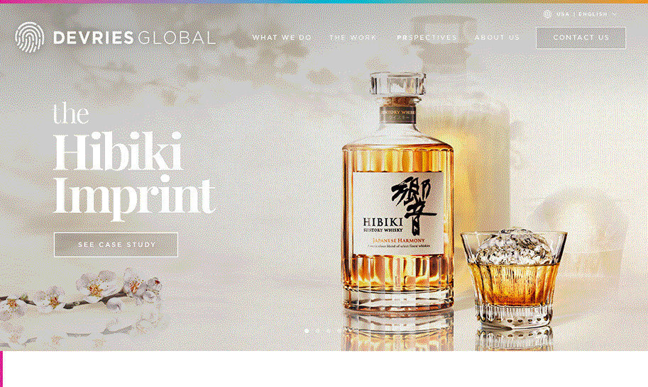
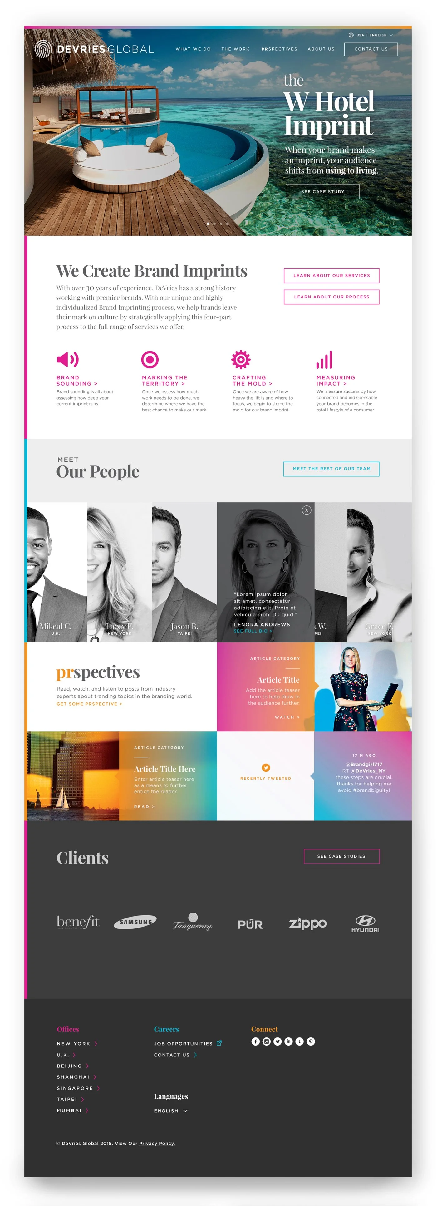
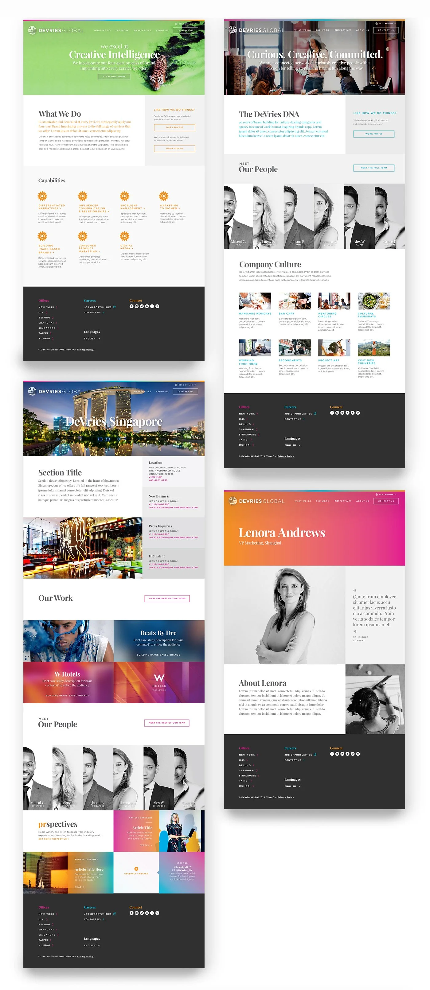
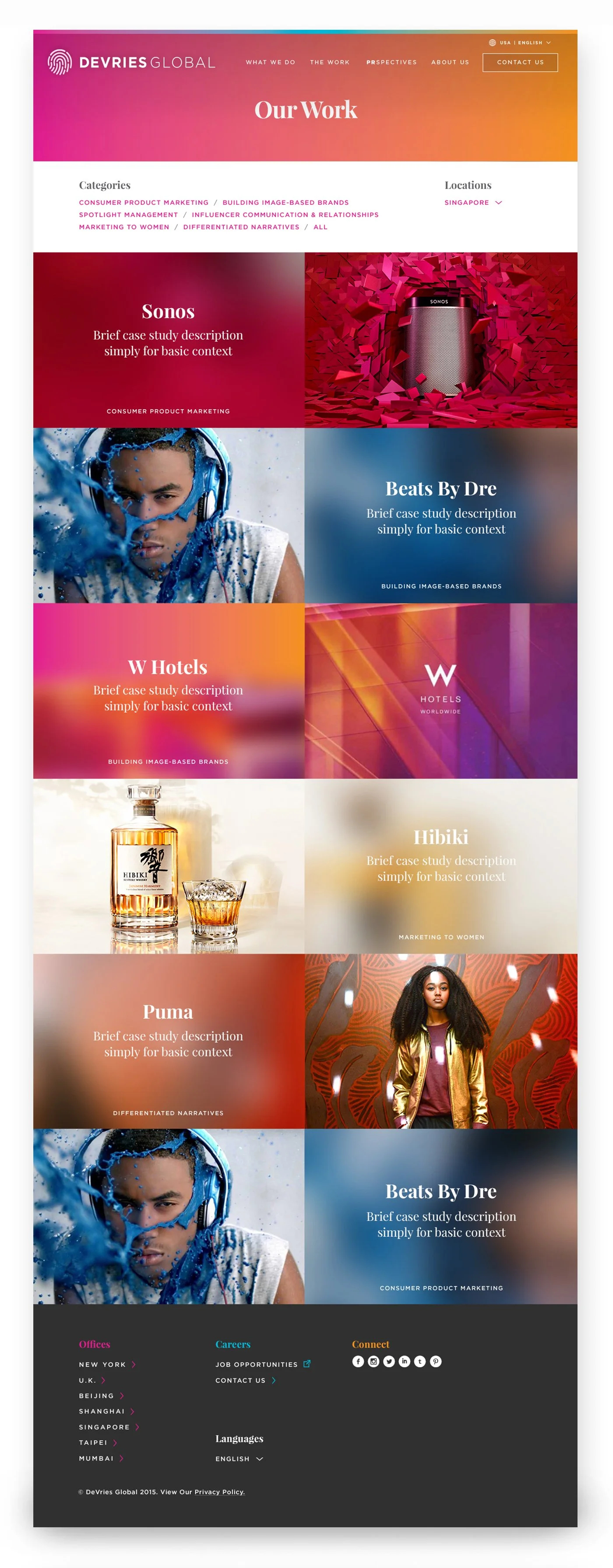
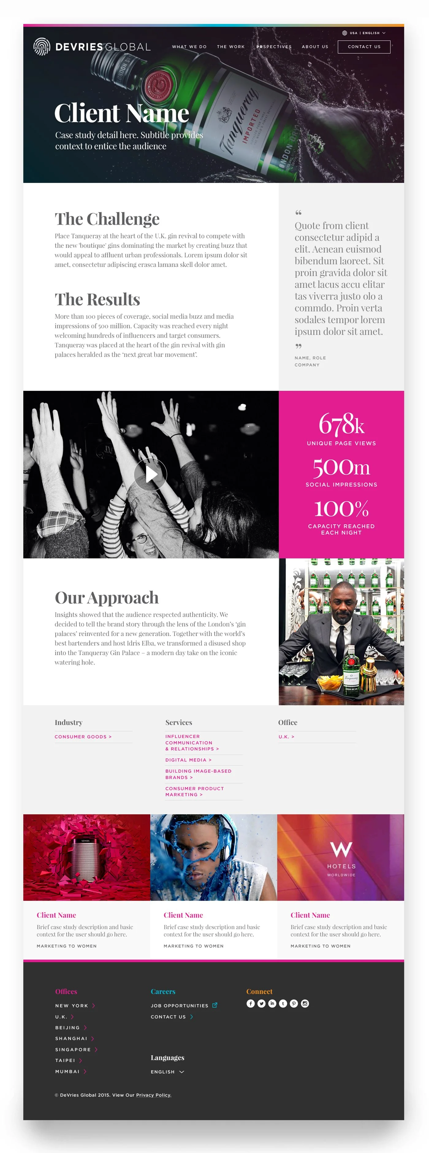
DEVRIES GLOBAL
Custom CMS Website for PR Agency
I led art direction and web design for DeVries Global, redefining their digital presence.
The work spanned typography, color, photography, and iconography, culminating in a fully responsive CMS built in close partnership with Strategy, UX, and Engineering.
The result: clearer user flows, improved usability, and stronger engagement—aligning the brand with the quality of its work.

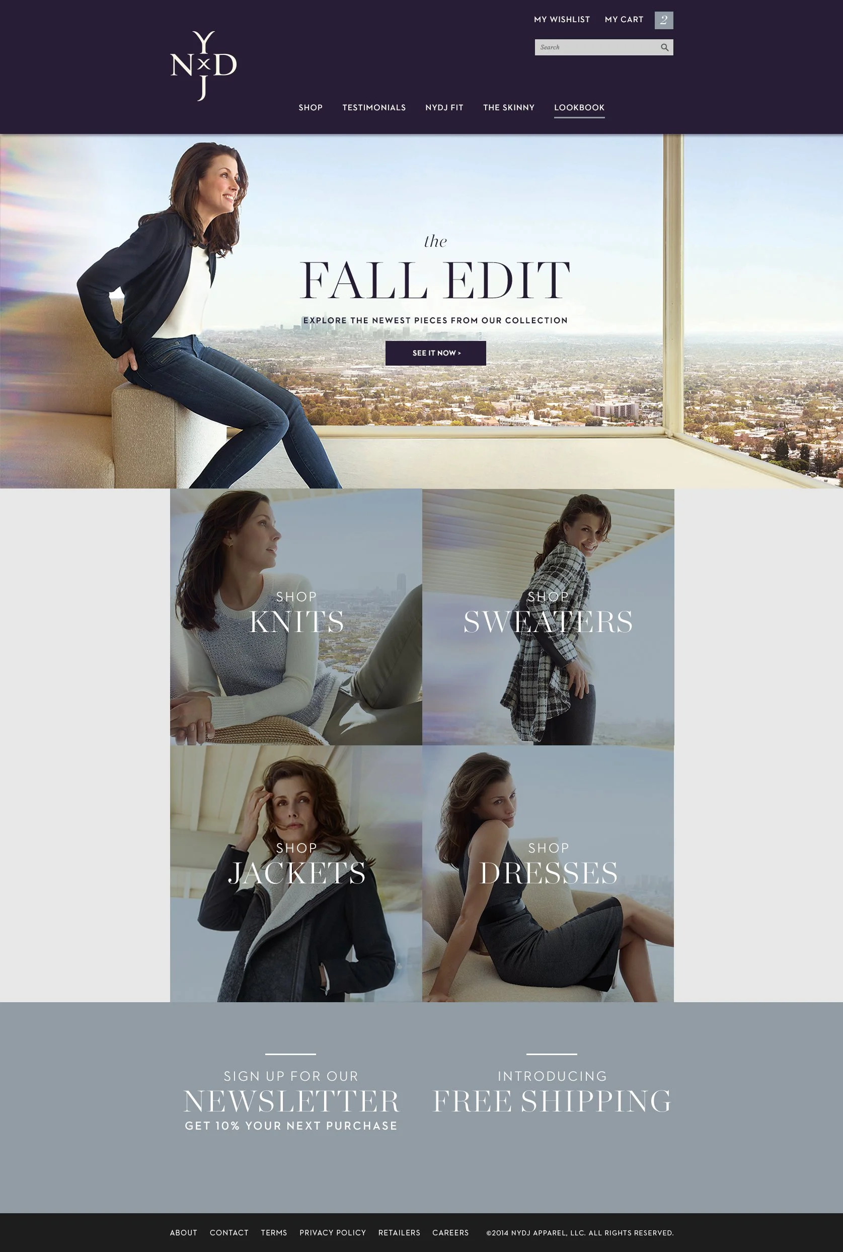
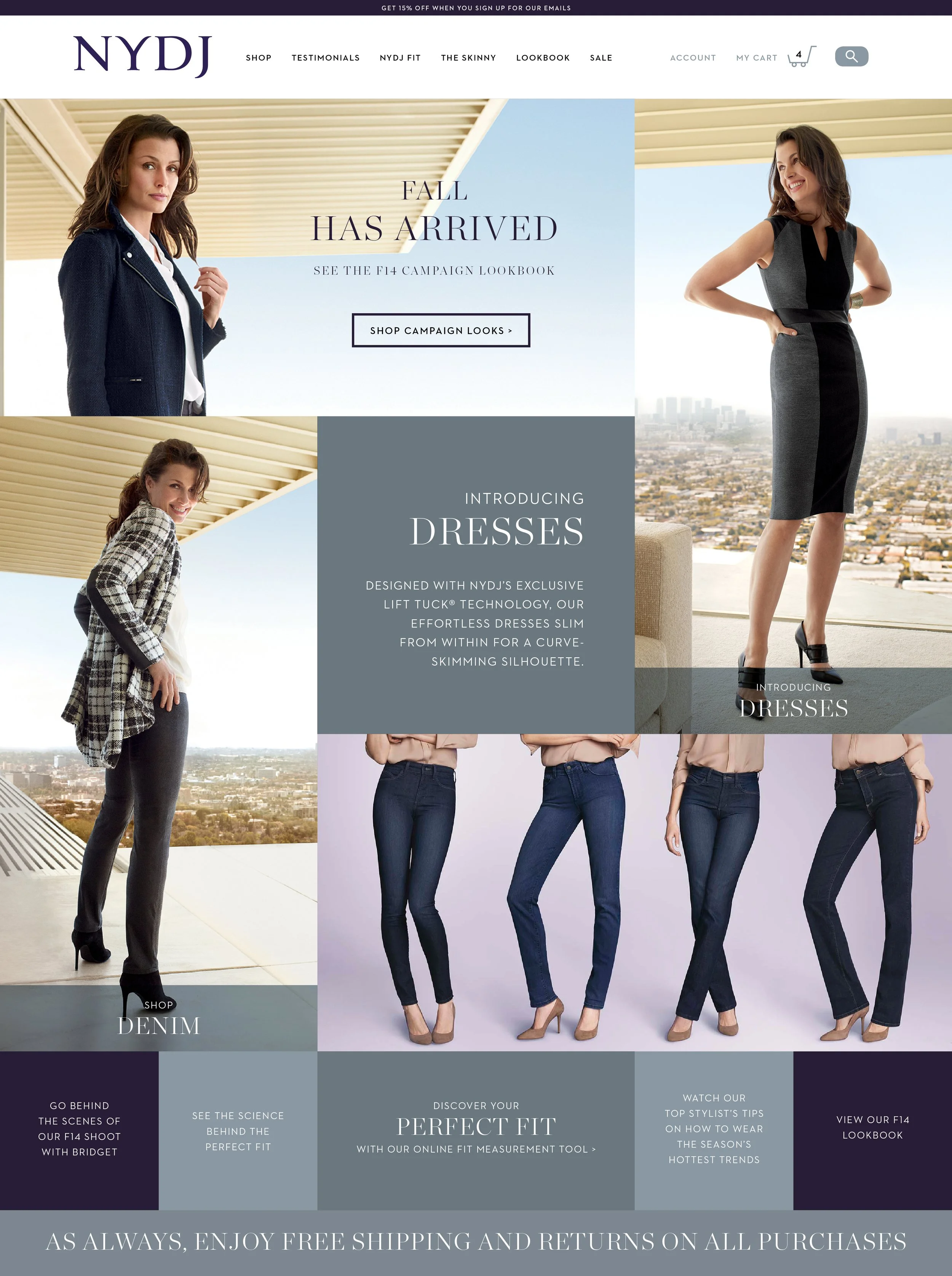
NYDJ
Elevating brand, product, and content for premium consumer apparel
While working on the NYDJ account at Toth + Co, I was responsible for a variety of design deliverables and art direction, including digital product design, web content design, brand book, seasonal omnichannel ad campaigns, product art direction, styling and shoots, product naming, environmental signage, tradedress, and more.
Throughout all of the deliverables, I explored the elevation of the brand through expressive typographic treatments.
Here are a few samples.