

How I used AI as a creative partner to create company system launch materials
As part of a year-long, high-stakes platform launch at EF, I used AI as a creative and strategic partner to rapidly design internal launch materials that energized engineering teams and supported adoption during a major systems transition.
BACKGROUND
While working as a Product Designer on the Engineering team at EF World Journeys, I was part of a major investment in technology and infrastructure aimed at transforming a long-standing “cost center” into a scalable profit engine. A core initiative of this effort was the consolidation of several aging, fragmented systems into a single modern Booking Engine—designed to support the business for the next decade while significantly reducing engineering toil.
In parallel, the organization was working toward true multi-tenancy: enabling three B2C sub-brands under the EF umbrella to operate on a shared architectural foundation. This shift allowed teams to deploy features more efficiently and freed engineering capacity to focus on platform-level work that better supported evolving business needs.
The initiative spanned roughly a year and culminated in a high-stakes launch just ahead of peak travel season. Engineering leadership coordinated on-site launch support across multiple offices and time zones (Boston, Denver, and Zurich) to ensure sales and customer service teams could transition smoothly—while anticipating and rapidly responding to the inevitable edge cases and bugs that surfaced.
Beyond my core responsibilities as a Product Designer helping consolidate experiences across brands, websites, and apps, I was brought in by the VP of Engineering and VP of UX to support the human side of the launch. I designed internal launch materials—including stickers, posters, and visual artifacts—to celebrate the work engineering teams had completed and to help new and existing staff feel confident adopting faster, more intuitive systems. The goal was simple but critical: build excitement, reinforce trust in the new platform, and empower teams during a period of significant change.
The only problem was that I was already fully resourced to ongoing work, so this project had to be done as quickly and efficiently as possible. After seeing constant AI case studies emerge around me, I decided to try using it on this ask.
THE VISION & ART DIRECTION
Throughout the year at town halls and other company-wide meetings, the engineering team was prompted to update the business on its progress. In order to maintain excitement for this initiative, there was actually an open poll/digital suggestion box to name the new booking engine. The name ABE (A Booking Engine) was born from this prompt and a staff suggestion. So, we ran with it. In preliminary stakeholder meetings about the booking engine, some folks were circulating a rough placeholder logo of a geographical pin with a stovepipe hat, and it apparently became quite beloved. I was asked to refine this logo for use across the business, so I worked on it in Adobe Illustrator.
For the other materials, I was asked to run with the ABE name and theme. We had one other system name to work with, WOJO ONE, so that would be part of the suite as well.
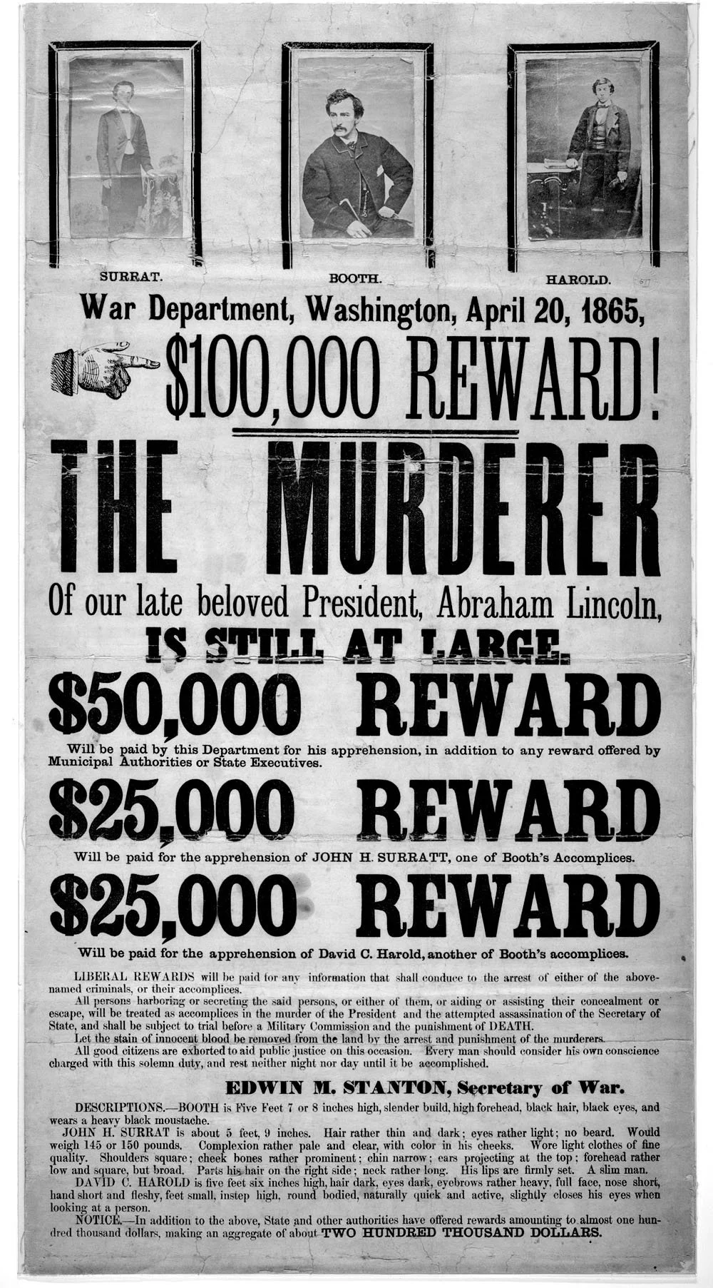
For the art direction, I wanted to merge the old with the new. The past systems, the Abraham Lincoln imagery, and this new mega-powerful tech stack that would bring us from the past into the great unknown. This conjured imagery of a kind of astronaut Abe Lincoln explorer, leading his people into the future. I envisioned really fine, detailed pen and ink illustrations, and thought of the work of Piero Fornasetti. Fornasetti takes these old-world style portrait illustrations and transforms them with a cheeky twist.
Throughout this process, I kept prompts and feedback short. I didn’t overdirect, because I was curious what the more default outputs would be. At the time, I was using the paid version of ChatGPT 3.5. I knew ChatGPT was not the leading visual generator, but it was the AI I’d been using most often, so I wanted to dive deeper and see what I could get from it. The following screenshots note “Made with the old image generation.” This is just because I’m documenting this process in retrospect :)
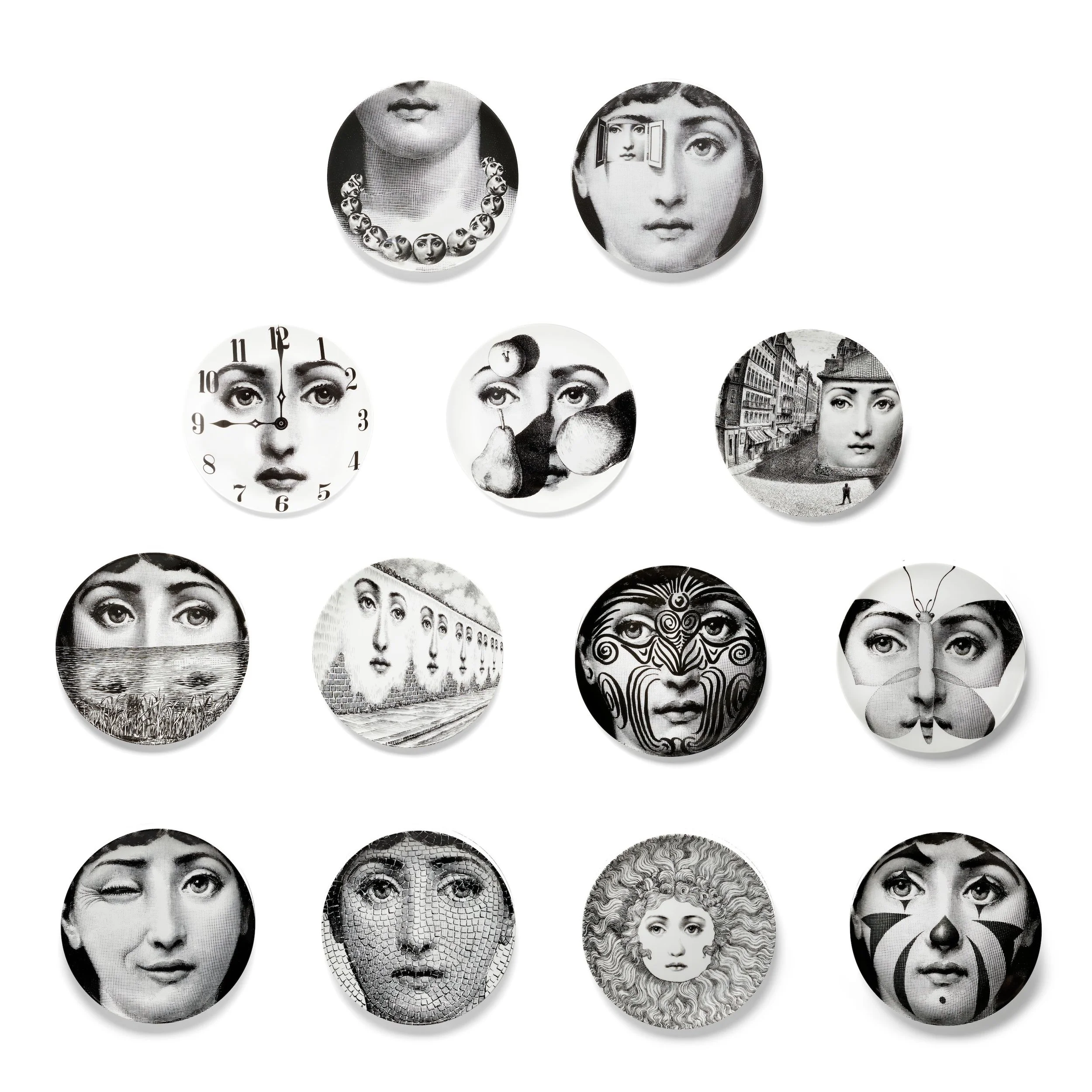
Piero Fornasetti illustrative plates
CHATGPT PROMPTING AND REVISIONS
ILLUSTRATION 1—ABRAHAM LINCOLN AS ASTRONAUT
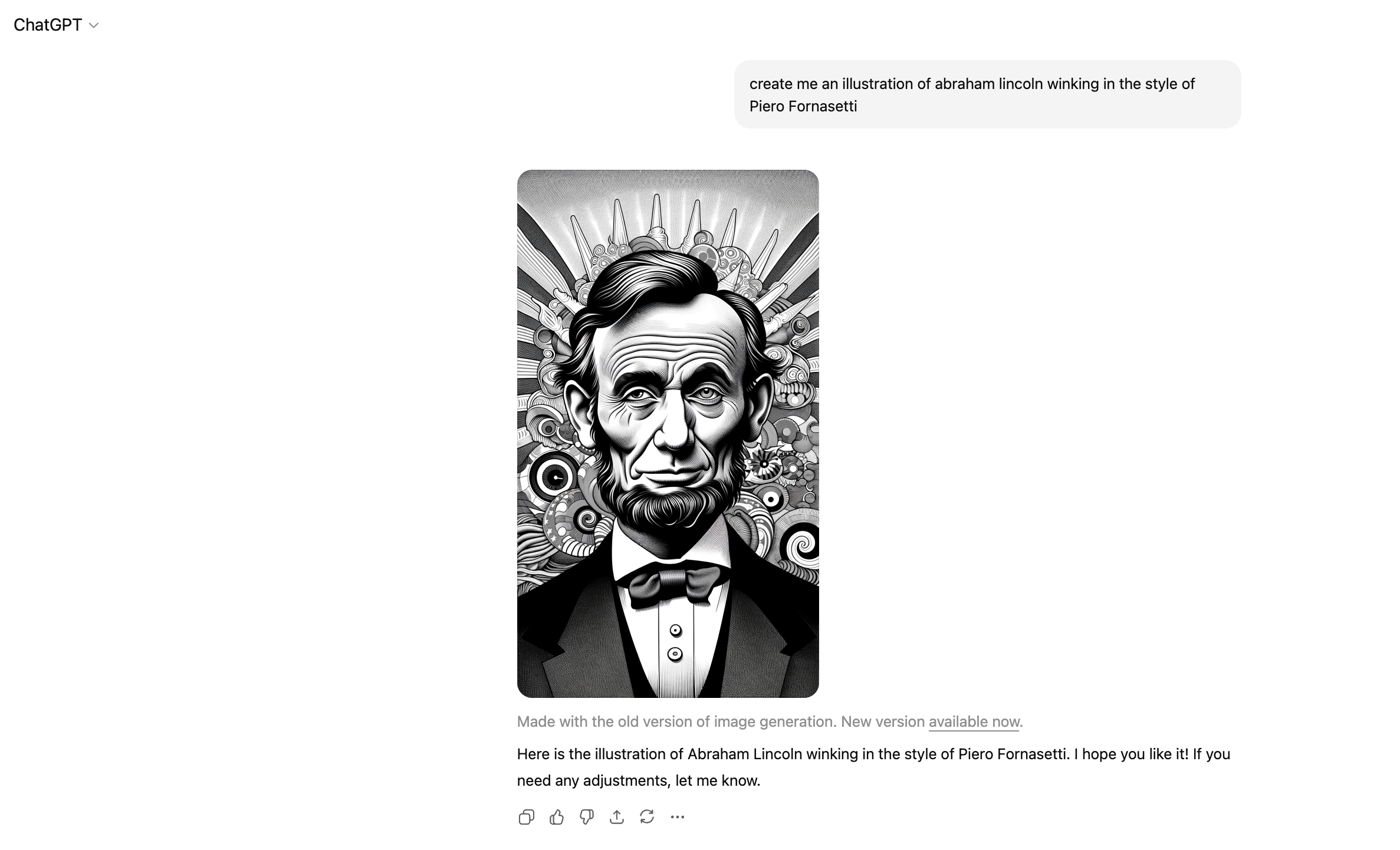
Where the background came from, I’ll never know. But interesting first take. Certainly not a replacement for hiring a talented illustrator with the right chops and style capabilities, but here I was. New territory with new tools.
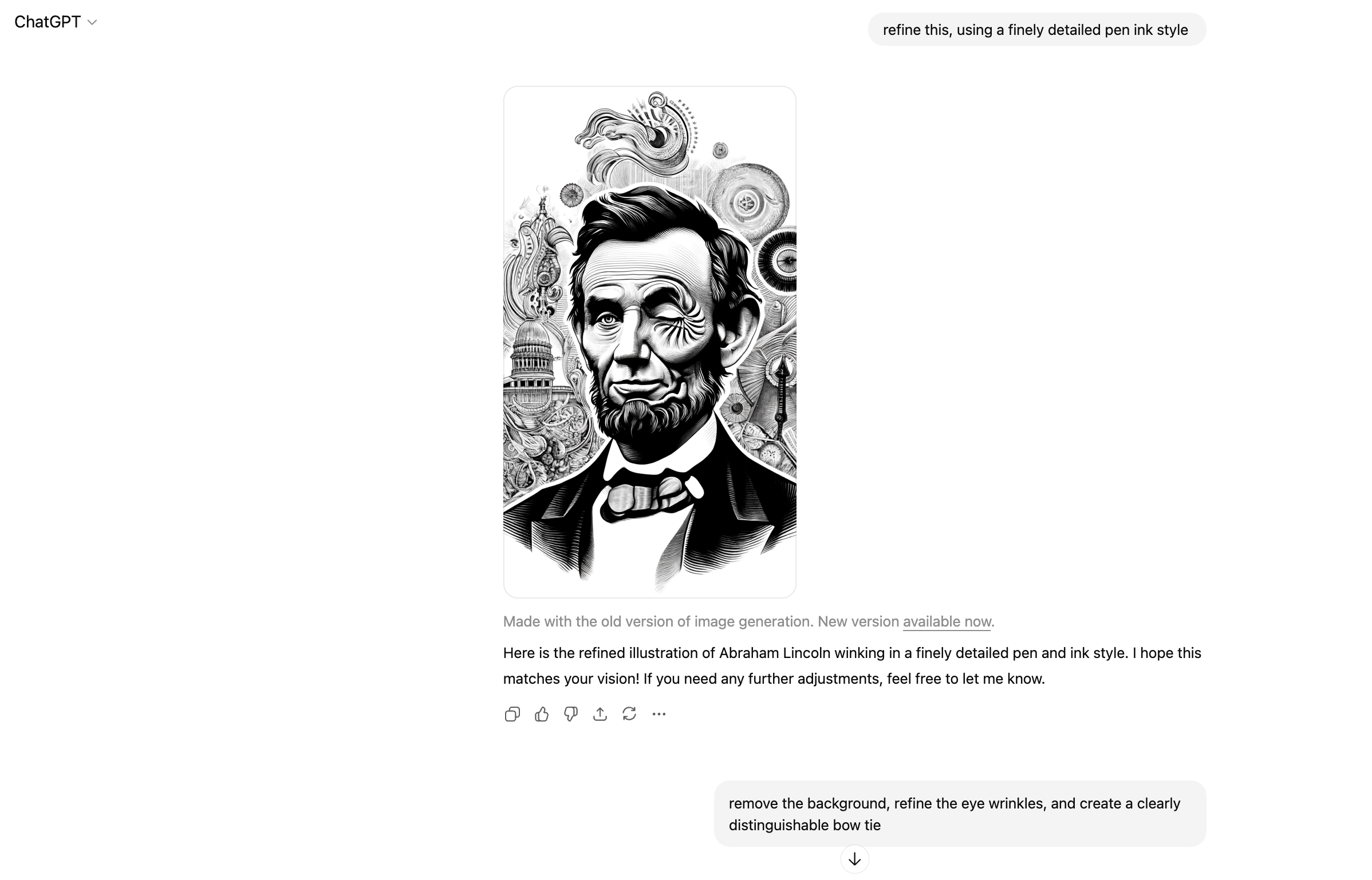
Okay, also not great. Background looks a bit like a psychedelic rendering of the capitol building as his eye spins into the abyss of the nation’s past. The bowtie is also somehow melting? The lips, the ears… yikes. I should just start from scratch, but I’m interested to see where the AI can take this with continued direction and refinement.
Sigh. Time to start over. This doesn’t look realisitic at all, but rather a sub-par interpretive drawing of him made out of partially melted wax.
The fidelity still isn’t there, despite my prompt asking for “finely detailed.” The expression does not look human or realistic. I almost like the the dry expression of the first one but it’s so far off in every other aspect that I opt for the one with better detail.
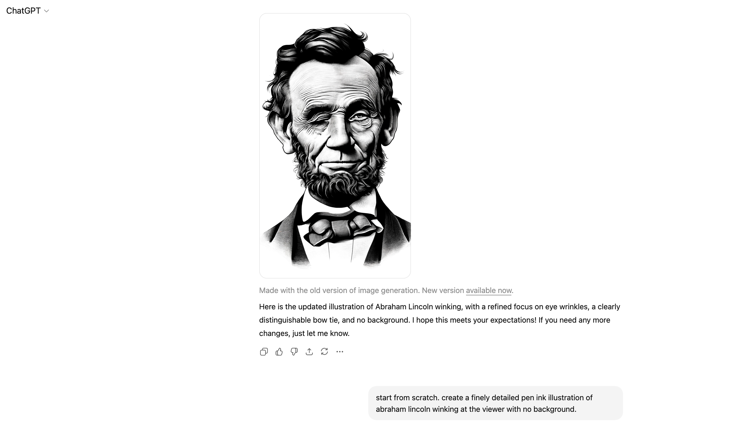
Okay, solid improvement. The detail has increased and the skin looks more realistic. The wink looks better. But why can’t it get bowties right? Hmm. Maybe we skip the bowtie.
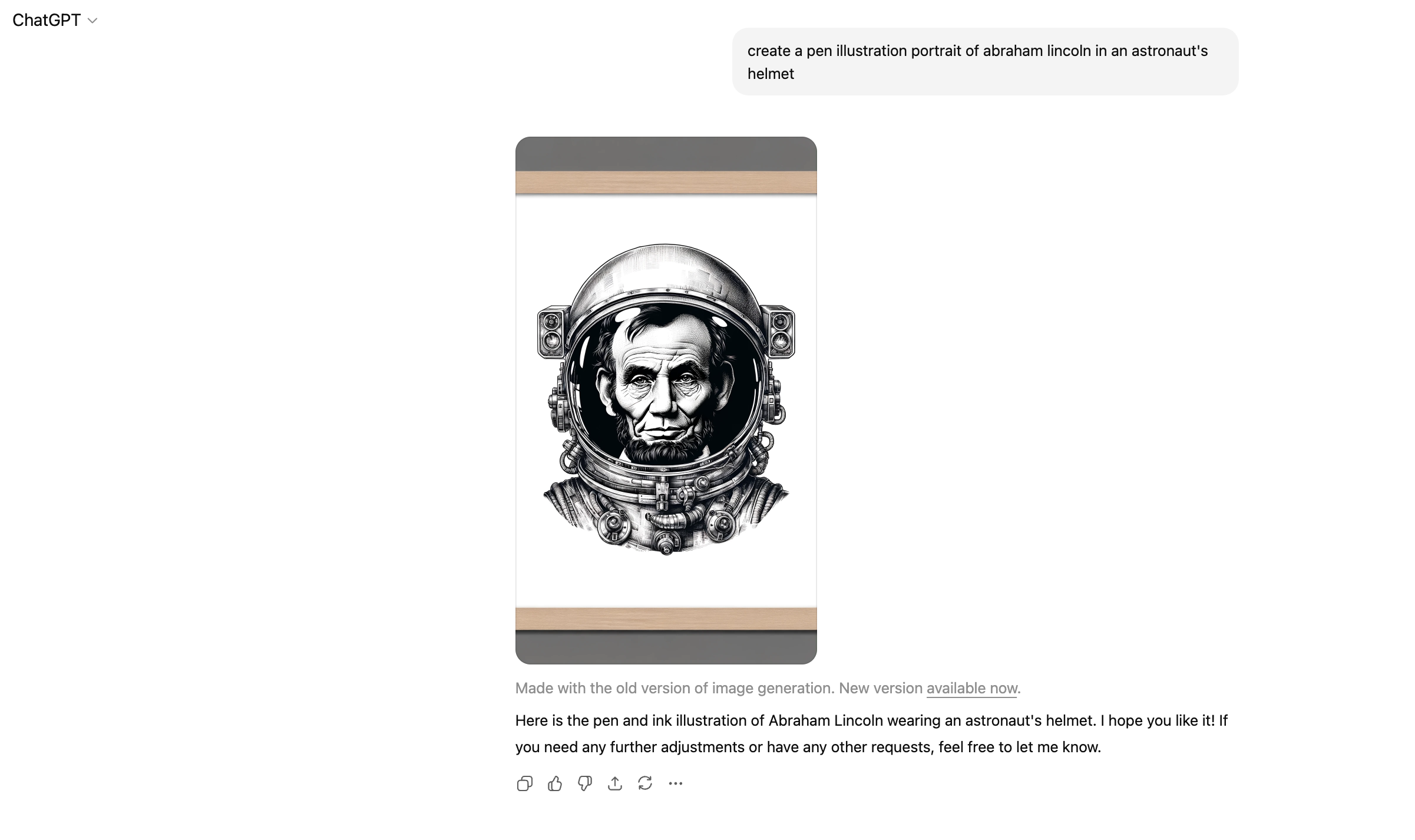
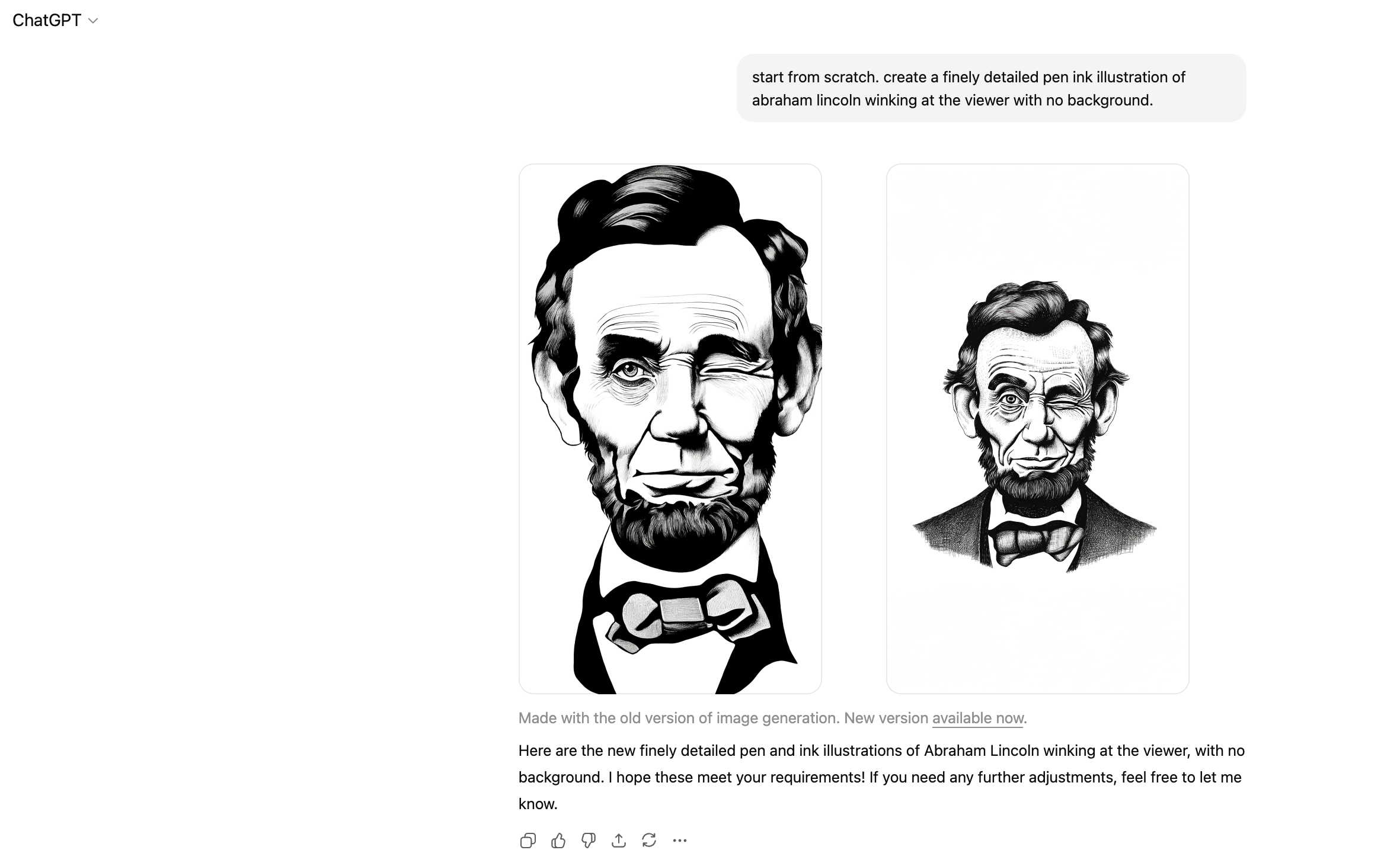
Yes. Extremely cool. Seeing this unexpected pairing is exactly the kind of retro-futurism I’m going for. I’m not sure where the frame came from, but the image itself is a great working direction. I decide to take this right into Adobe Illustrator and Image Trace it to get a vector format to play with at infinite scale/resolution.
CHATGPT PROMPTING AND REVISIONS
ILLUSTRATION 2—ABRAHAM LINCOLN AS ASTRONAUT
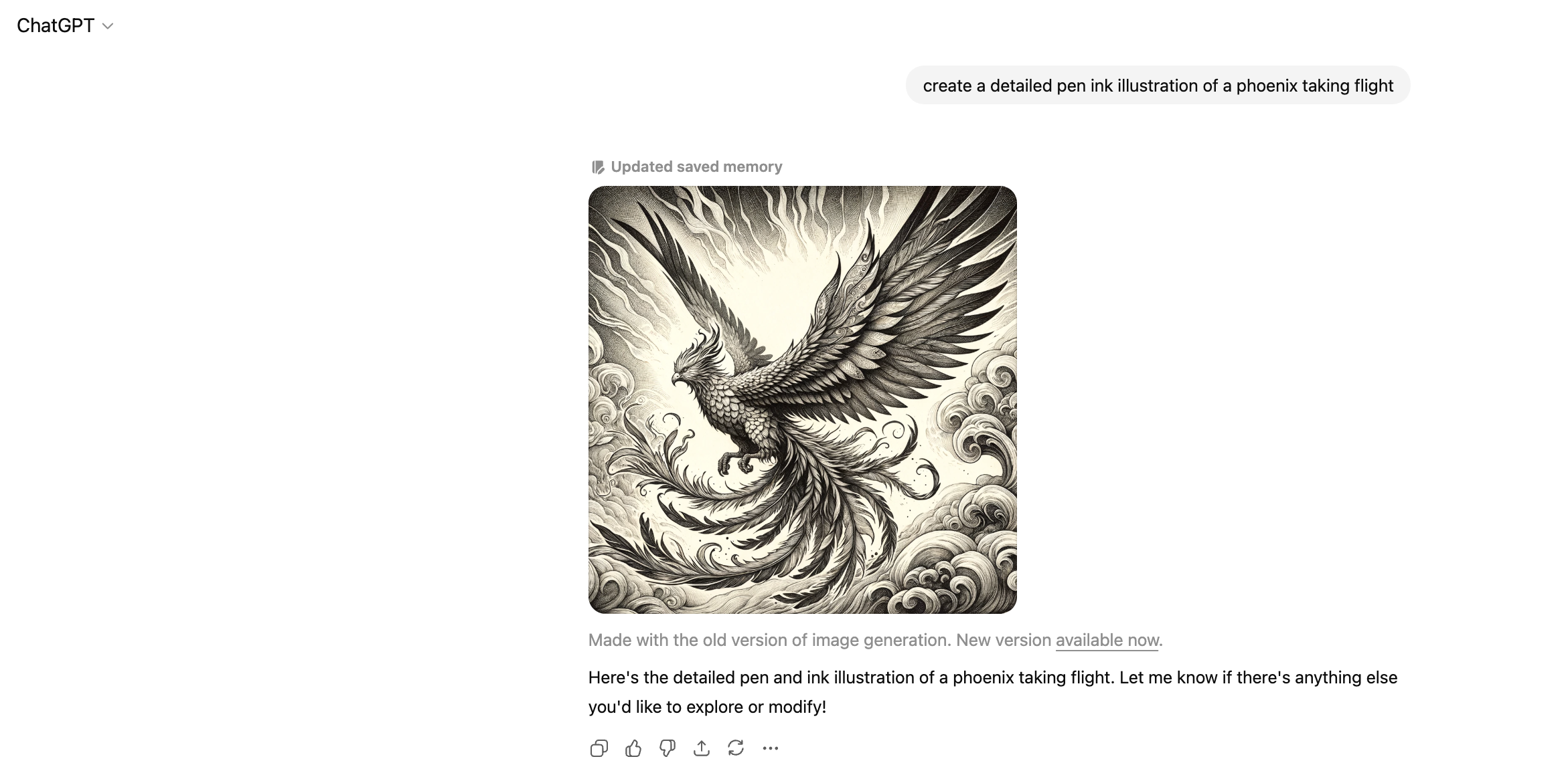
One of the outgoing tech systems was called Phoenix. I had the idea to create a few prohibition-style wanted posters/decrees to display in the offices as an announcement for the launch. I decided to personify Phoenix as its namesake mythological creature, so I needed an illustration to go with it.
This one was much easier, lending support to my theory that ChatGPT/DALL-E struggles with recreating human forms.
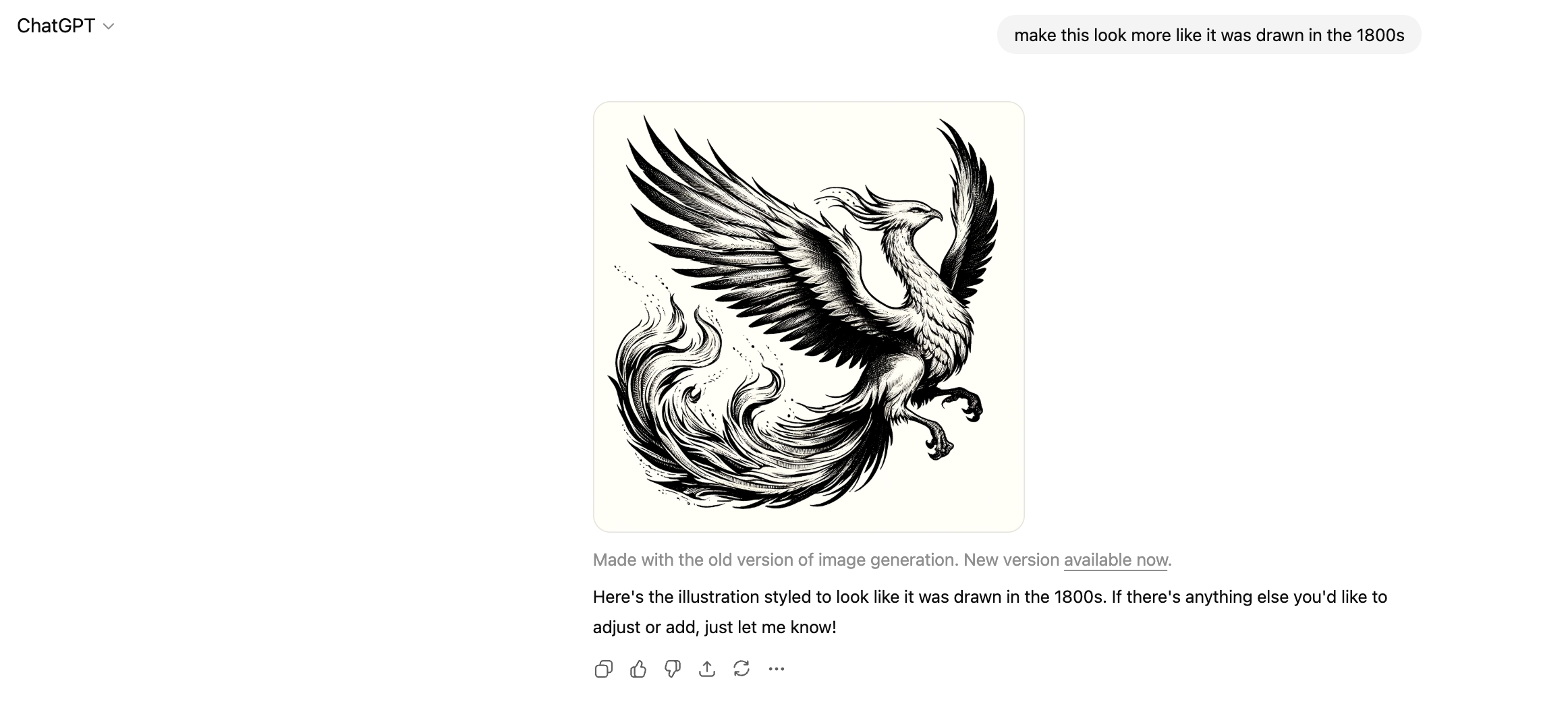
Alrighty. It really ran with the fantasy angle here. Definitely need it isolated (should have specified “spot illustration”). Also don’t want it so art nouveau and flourishy. I’m curious to try specifying a time period instead of a style.
Better. Still more sprawling and active than I’m looking for.
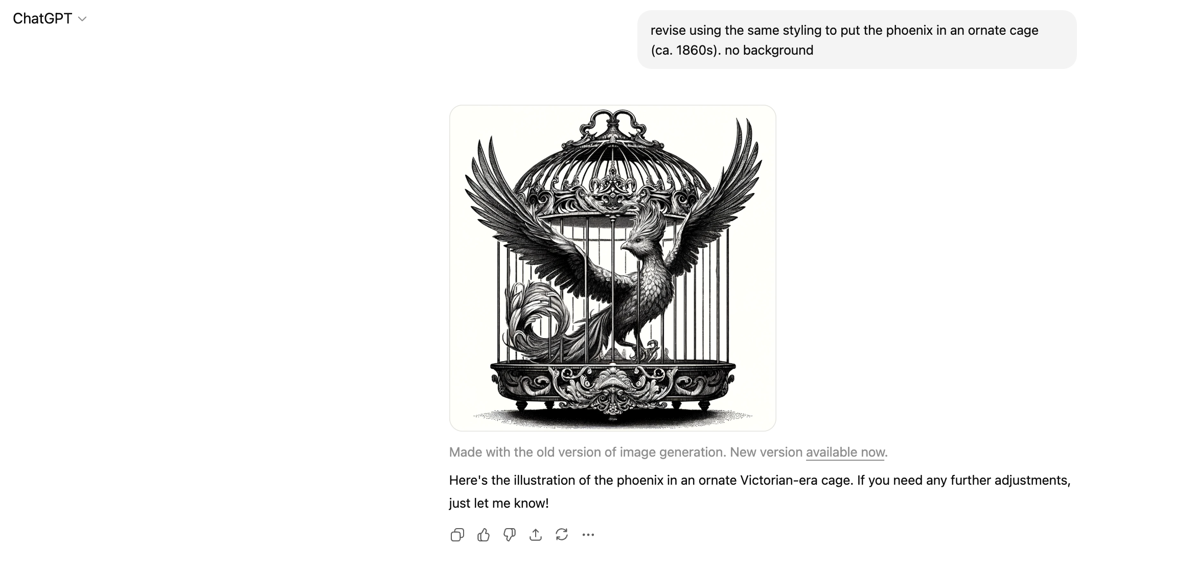
Overly ornate but definitely going in the right direction. The cage itself now looks more Victorian than I was envisioning (interesting that it applied that style when I specified 1860s). I want it to feel more American to pair with the Lincoln direction, but of this era (I wish I had been clearer about this, but I was working too quickly at the time).
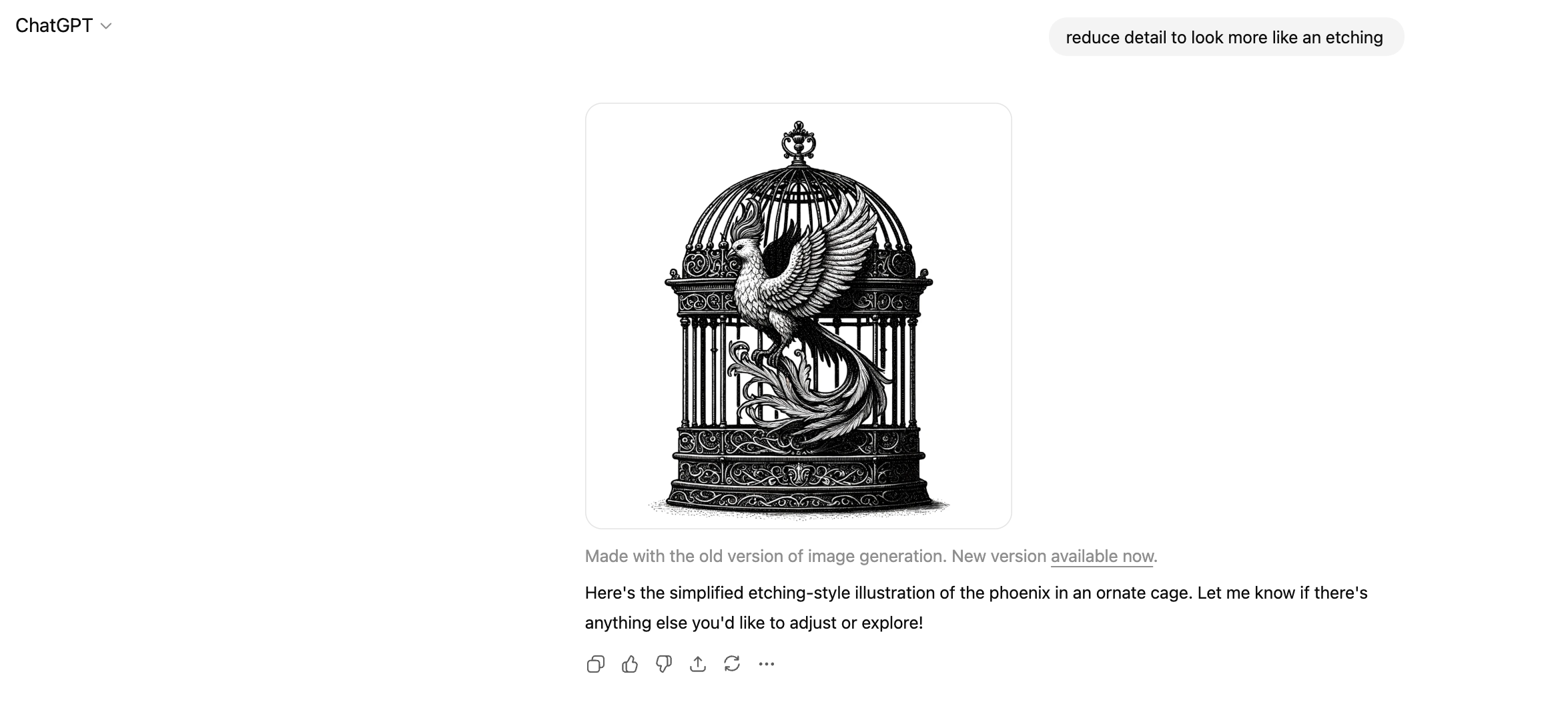
This got colder from what I was looking for. And why is it outside the cage? Hoping the next prompt redirects it. Etching was probably the wrong direction to give.
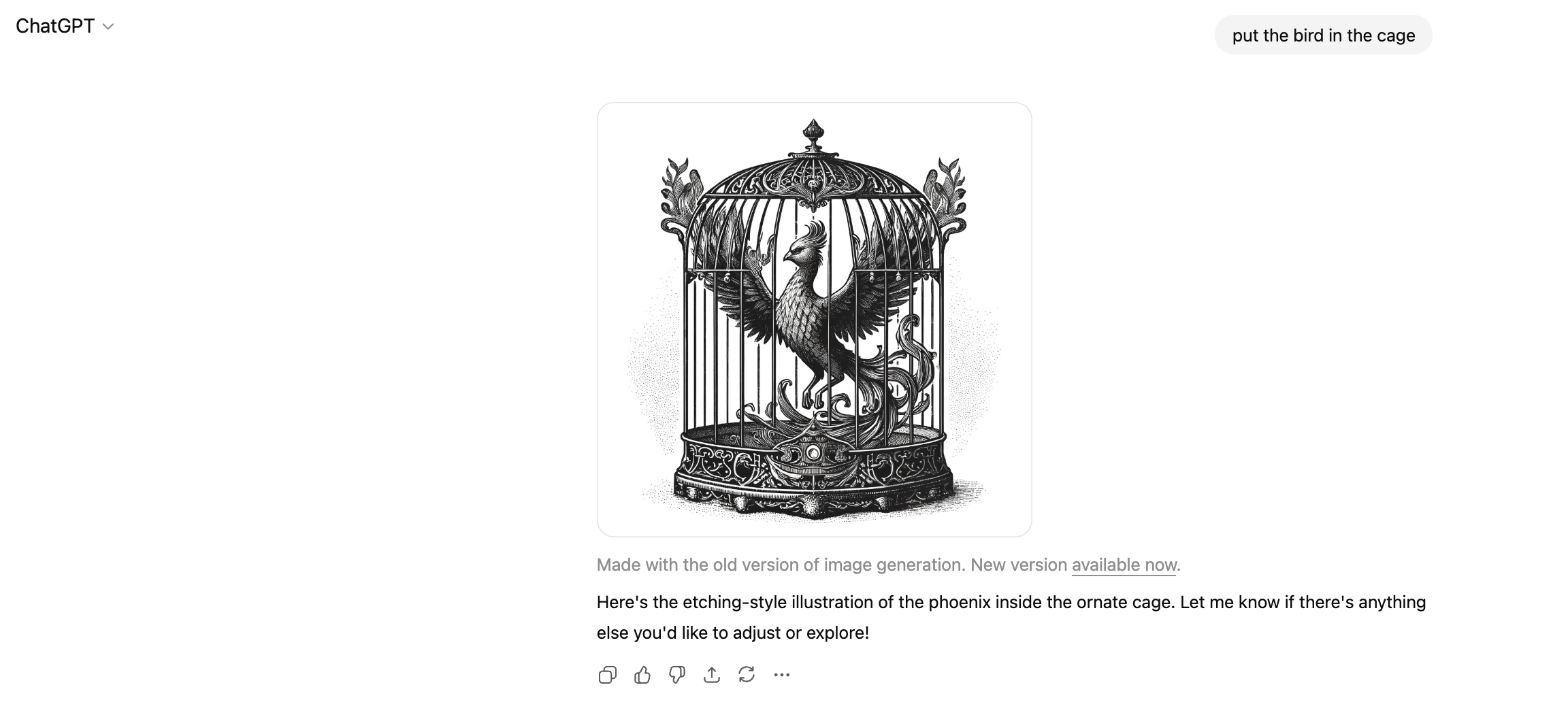
This is workable. I like the halftone and shadow details in this version. It more closely matches the Lincoln illustration, which is what I’ll need when creating a set. The way the wings are peeking through the cage is a little funky, and it seems odd to have such a wide opening in the center, but this feels solid to play with. I download this and play with it after converting to vector format in Illustrator.
CHATGPT PROMPTING AND REVISIONS
ILLUSTRATION 3—ROCKET SHIP
Now I needed some space elements to bring the future and discovery part to life. This was the easiest of the prompts by far. I do wonder if it was partially due to A) the subject being an object vs. an animal or person or B) the AI’s memory having updated and remembering my prior chats to get to the result faster.
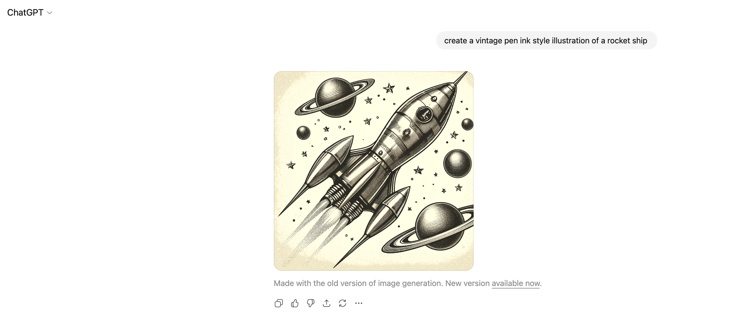
Bam. Yes. Retro-futurism with the level of detail I’m looking for. So easy. This AI thing might be helpful after all. Now to put these elements together and get some layouts that feel right.
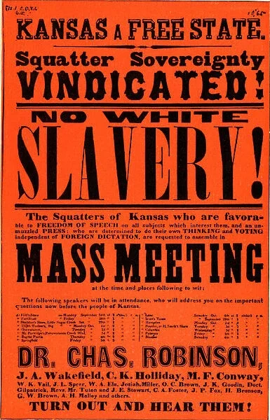
POSTER INSPIRATION
PUTTING THE PIECES TOGETHER
POSTERS & STICKERS
After vectorizing these illustrations in Illustrator, I got to work on some sticker and poster design options.
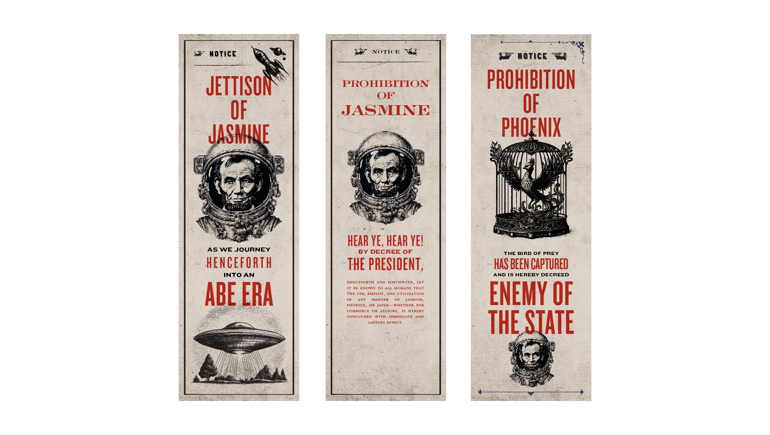
First round/roughs. I prompted ChatGPT for initial copy to get the direction down. I later tweaked this myself, and then again with some stakeholder feedback.
I used typefaces Knockout and Engravers to play with. Knockout is one of my favorite typefaces, but it was first created to mimic poster lettering, so it’s an easy solution for this kind of work. Engravers suits the Lincoln era aesthetic, but it didn’t have the same impact of Knockout, so I stuck with the poster-style type.
The spaceship illustration actually came from Shutterstock. I had found it the very first day I was prompting the Abe illustration, and it fit with the set very nicely.
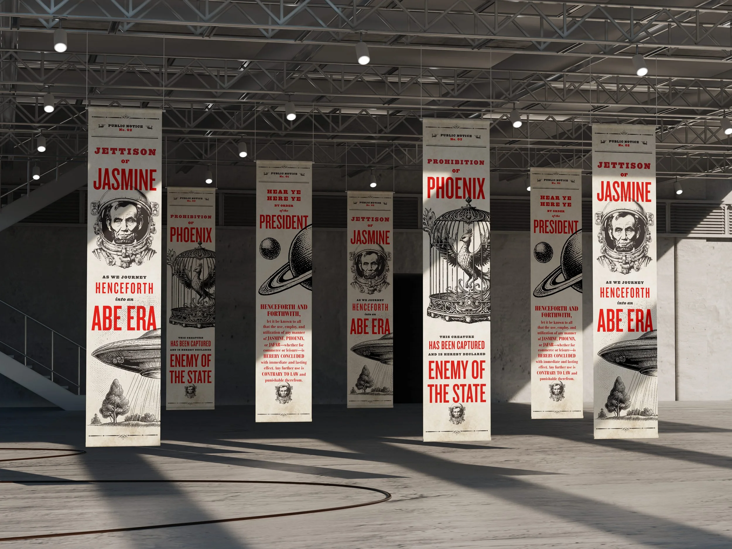
Finalized poster designs. Layout completed in InDesign. If you look really close, you might notice some inconsistencies in the type of shading and halftone details. But overall, these worked as a set under the time constraints and as a general set for a 98% non-designer audience. If this was an ad campaign or external event, or if I had more time resourced for this work, I might’ve fine-tuned the level of detail to make them even more consistent, but I’m glad I experimented this way.

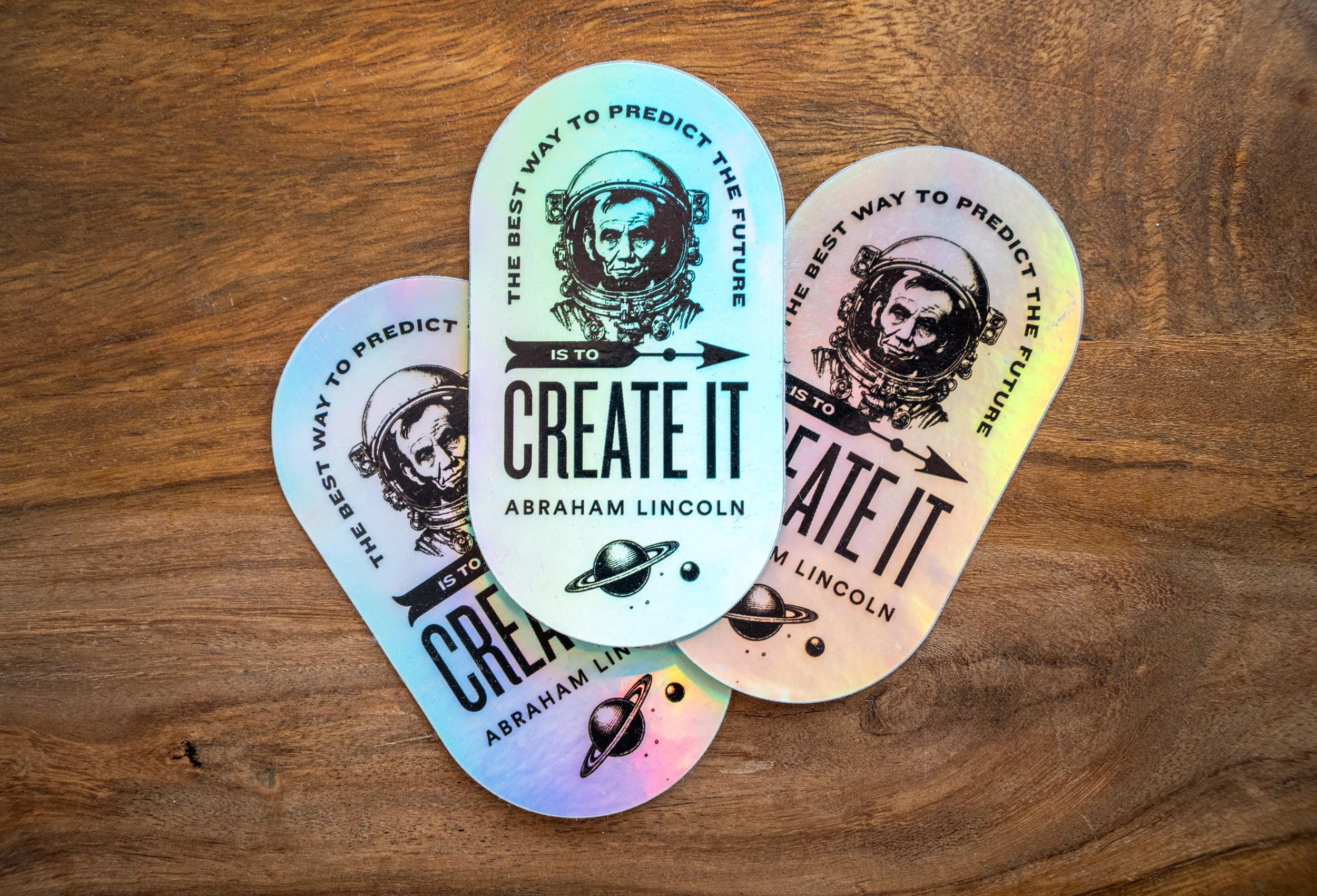
Some of the sticker designs for the launch. I’ve spotted them on laptops, waterbottles, notebooks and more.
Overall this was a fun project to test the AI waters. I think there’s a long way to go for ChatGPT/DALL-E’s image generation capabilities, and to be fair—my prompting was very minimal. In the future I’d ramp up the specificity, play more with feeding it examples and styles via file uploads and links. I might do a future edit of this post that shows the new image gen capabilities and what more thorough prompting would’ve netted me, but this is my Point A.