

Creating a digital presence worthy of a global agency’s world-class clientele
I led art direction and design for PR firm, DeVries Global, redefining their omnichannel presence.
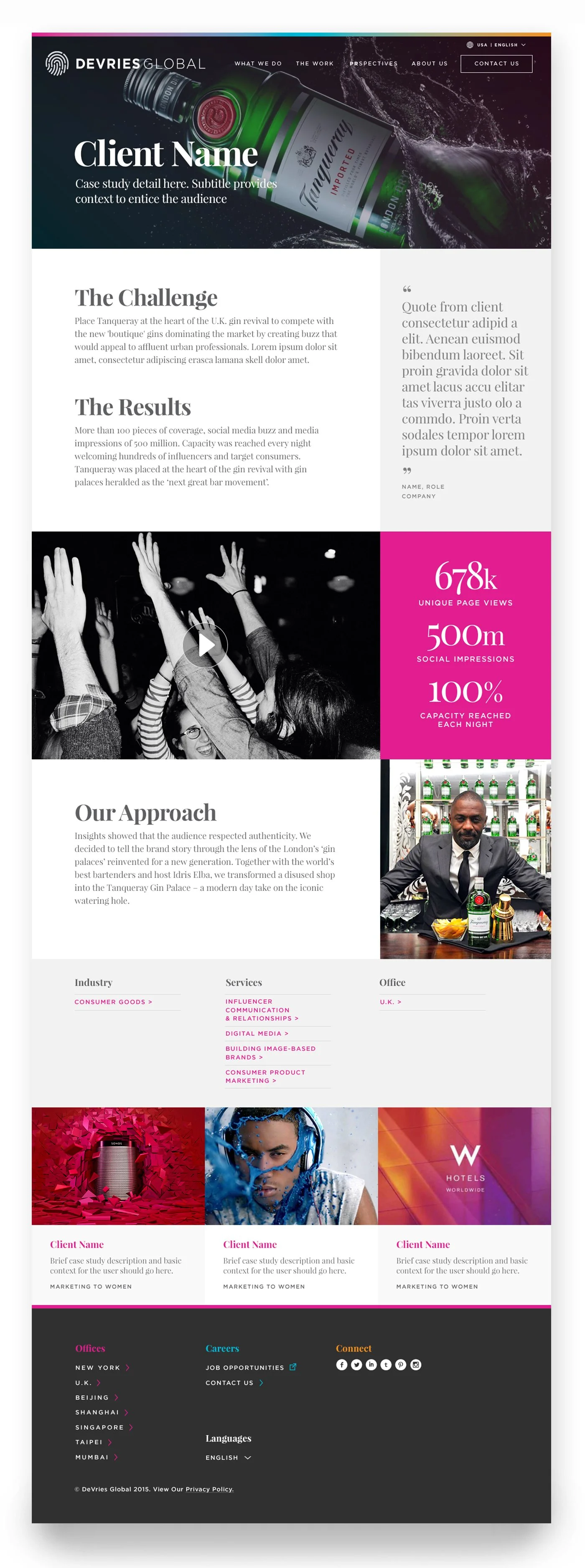
The work spanned logo redesign, typography, color, photography, and iconography, culminating in a fully responsive CMS built in close partnership with Genuine’s Strategy, UX, and Engineering teams.
The result: clearer user flows, improved usability, and stronger engagement—aligning the brand with the quality of its work.
AGENCY
Genuine
CLIENT
Devries Global
ROLE
Art Direction
Website Design
Product Design
Logo
The logo was the first thing to be addressed. No matter what we did to the website, the logo would be holding back the overall perception of their business. We made some small tweaks that helped signal a more premium authority in this space where perception is reality.
Forcing letterforms to serve as an image within the logo is one of the quickest ways to signal an organization doesn’t get design. Beyond that, it hinders legibility and erodes recognition. So I stripped out the fingerprint from the wordmark, and used a more modern sans serif typeface (Gotham) to offer a cleaner read of the name. I then took a look at the fingerprint mark and refined it to maintain brand continuity, but with a more elevated output.
Little tweaks = big difference
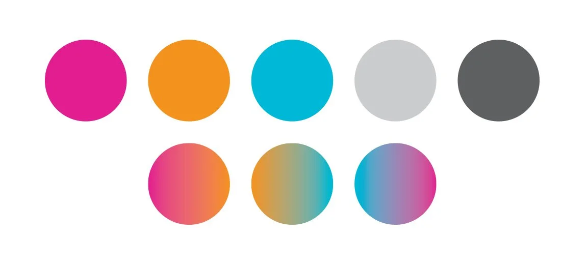
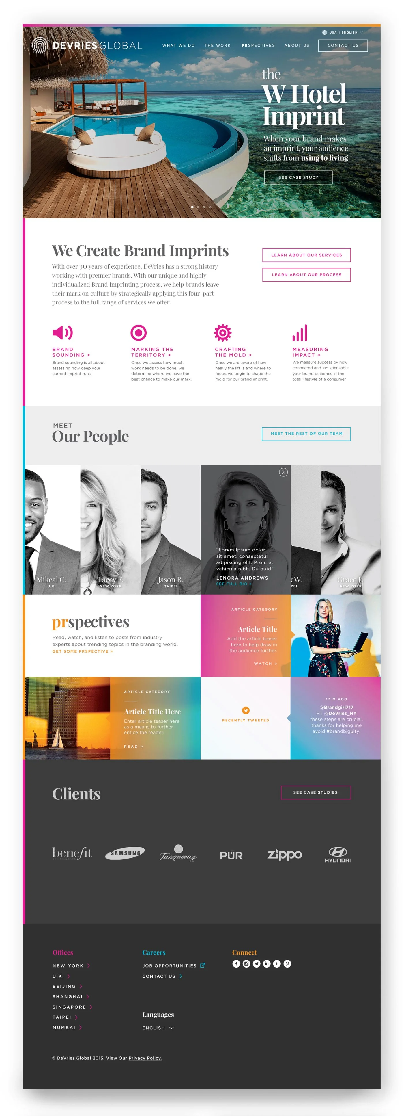
Color
The color system used vivid gradients to reflect DeVries Global’s energy, reach, and constant movement. Inspired by the flow of people and ideas across offices and time zones, the palette brought warmth, dimension, and contemporary polish to the site.
Because the colors carried so much personality, the supporting palette stayed intentionally restrained: soft whites, grays, and generous negative space gave the bold moments room to breathe. A subtle animated header extended the system with a sense of light, motion, and global momentum.
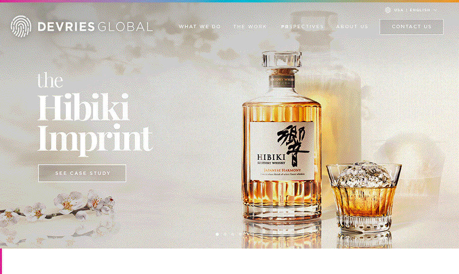
Imagery
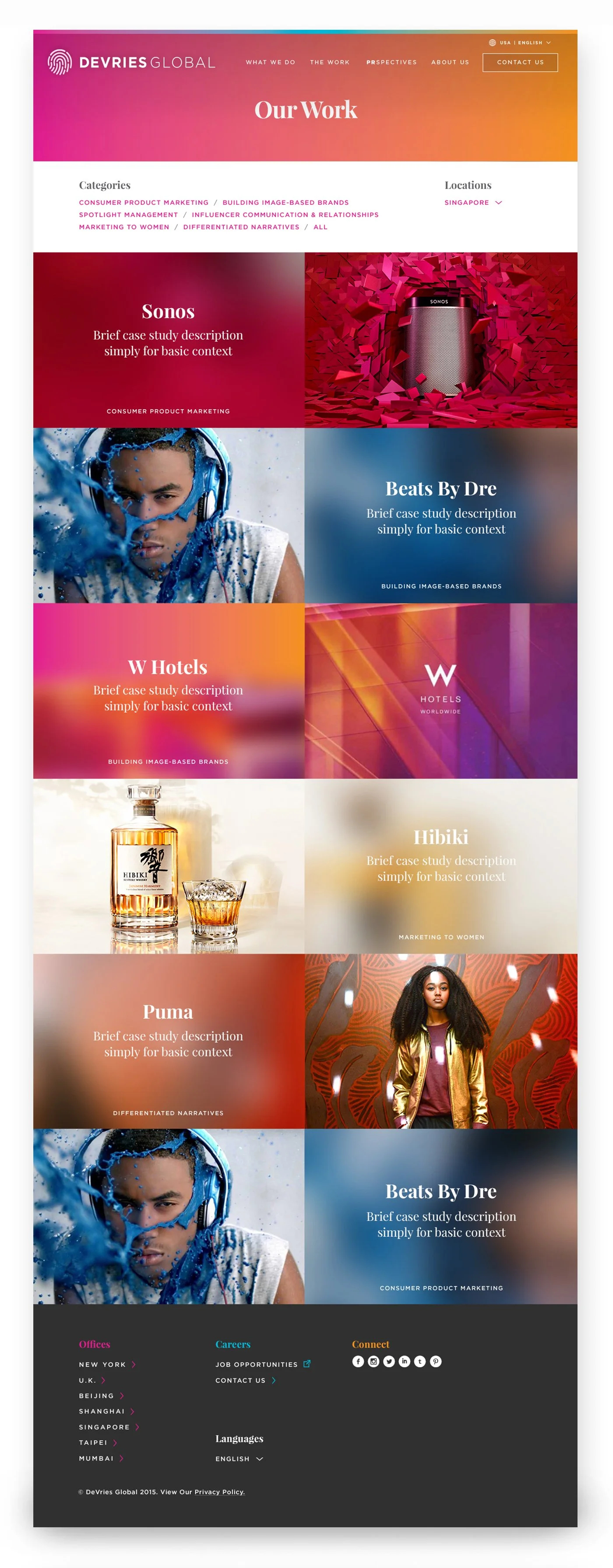
Photography was directed to feel vibrant, high-contrast, and compositionally strong, with color either aligned to the brand palette or subtly enhanced to feel cohesive within the system.
Team imagery was primarily treated in black and white to create a sense of unity and consistency. When color was used, portraits needed to feel elevated and editorial: clean studio lighting, strong contrast, and a white backdrop.
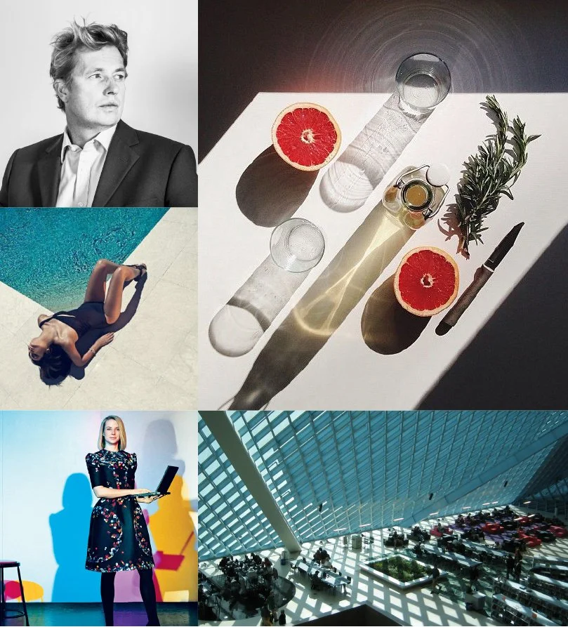
Strong diagonals and guiding lines
Photography was often chosen for its strong diagonal and guiding lines, which introduced movement and structure while reinforcing the brand’s sense of momentum. This gave the imagery a more dynamic, editorial quality.
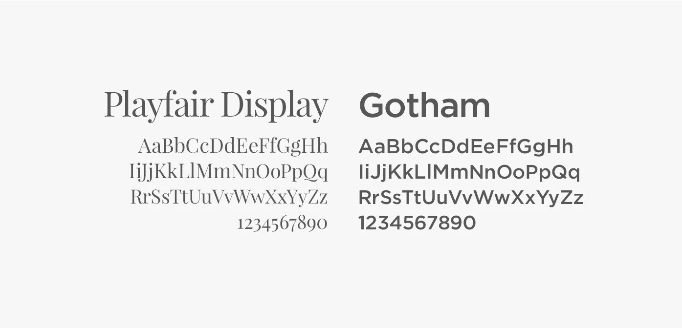
Typography
DeVries was already using Gotham as its sans serif, so I introduced Playfair Display as a refined editorial counterpoint. Its bold, elegant forms added warmth, sophistication, and a sense of luxury, balancing Gotham’s clean, functional structure.
Together, the pairing created a typographic system that felt polished and modern: Playfair brought distinction to headlines, while Gotham supported clarity, navigation, and everyday usability.
Homepage
Page templates
Template 1
Homepage
Template 2
Work Landing
Page templates
Template 3
Work Landing
Template 4
Project Page